Clothier Connect promises to be an awesome utility app for people who sell apparel. The tool will help career-minded users capture and leverage client knowledge to increase sales effectiveness.
The Problem
Still fully focused on developing the app itself, John Durden, Clothier Connect’s creator, found it challenging to set the brand’s foundation and build an appropriate identity atop it. He enlisted my brand consultancy, Thinkory, to help think through core values, unearth deep truths and develop a manner of expression that would win trust and adoption by business-minded salespeople.
The Thinking
Design a winsome mark that welcomes the sophisticated. A brandmark and identity crafted to feel like an outgrowth of the fashion and clothier community; the product of a culture, not merely a product for it.

From the start, Clothier Connect’s name was to be displayed in the tall and stately Archer Book typeface. It was the only form of identity John used for the brand. Initial explorations centered around that font and this image which was an unsuspecting inspiration. The image was a screenshot of a screenshot that John sent me via text. I found beauty in the digital degradation.
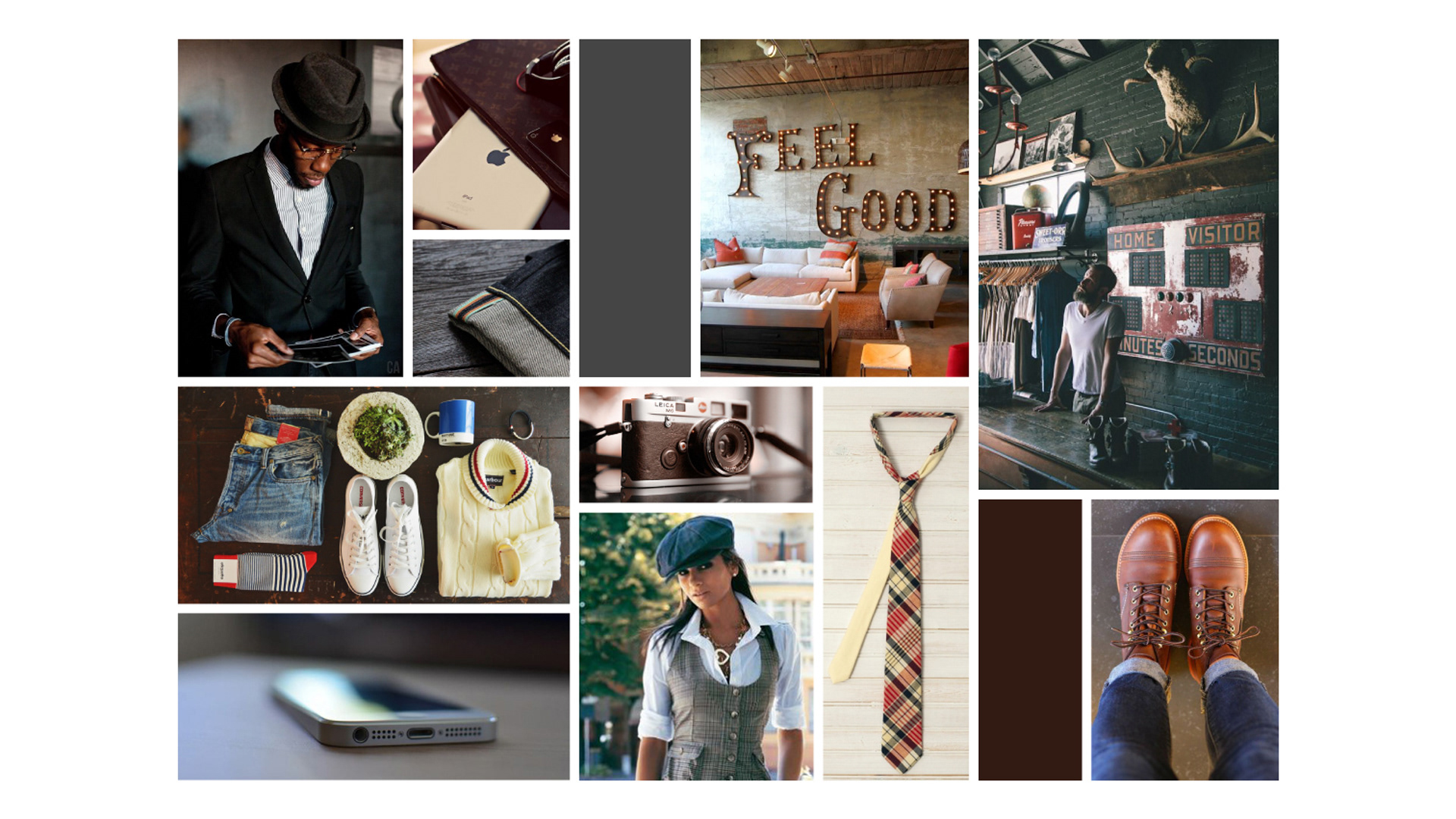
The mood board John and I assembled for this project captured a sure-of-self, jazzy and crafted feel. It set a smooth, confident tone for what would be the brand’s charismatic character.

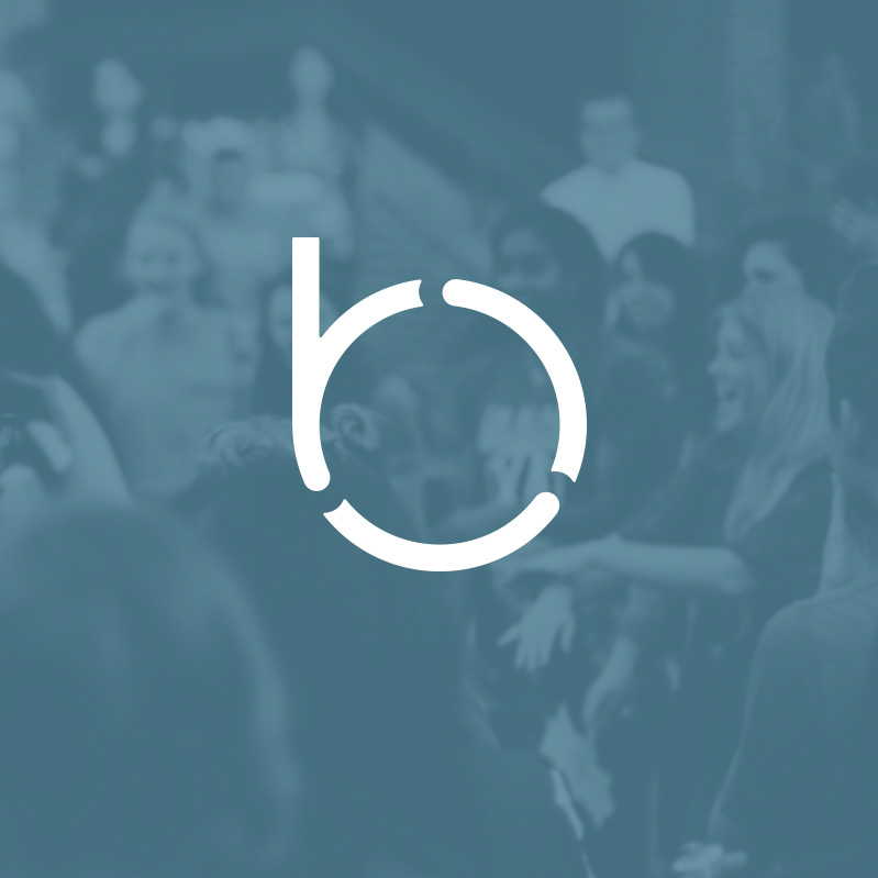
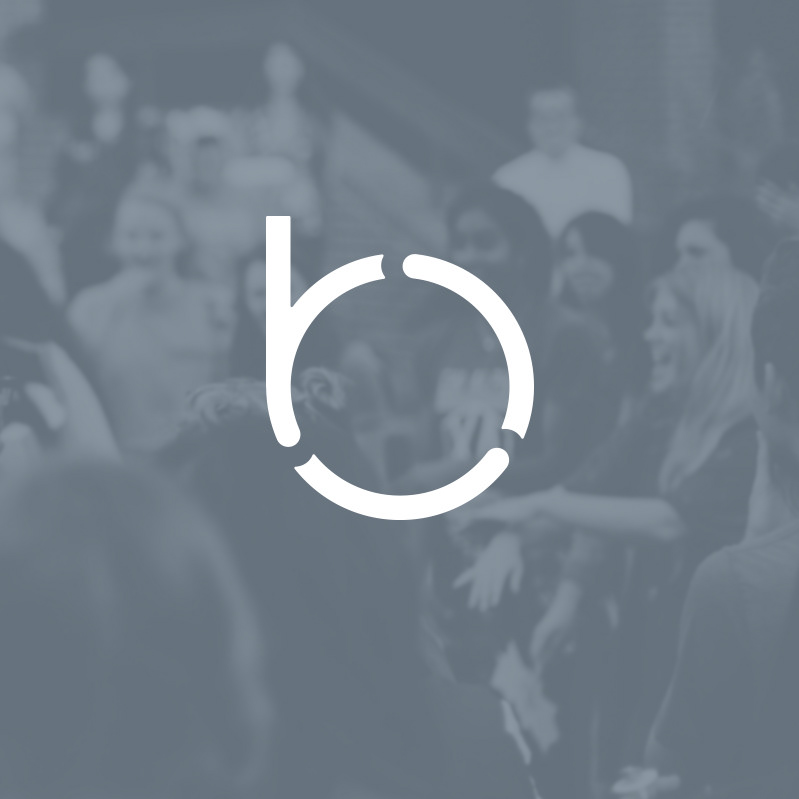
After a series of explorative iterations, I crafted this; the Clothier Connect monogram. I designed this mark with a single, continuous and imperfectly patterned thread. The thread signifies a contentedness between the clothier and their clients.

The single thread that creates the Clothier Connect monogram splits in two locations to take on new forms. The hidden detail is small nod to the oddities that make us unique and our connections to one another special.

Considering the creative brief and mood board developed with John, the mark needed to do more than follow the visual rules of an app logo. It needed to feel like it belonged to the clothiers and apparel sales people who would be expected to adopt it. The brandmark was crafted to feel more like it belonged on a shirt label than on an app icon.
Knowing that Archer Book was to be the central font for the identity, a narrow san serif was determined to be the ideal complement. The versatile and web font-available Roboto Condensed fit the bill rather nicely.
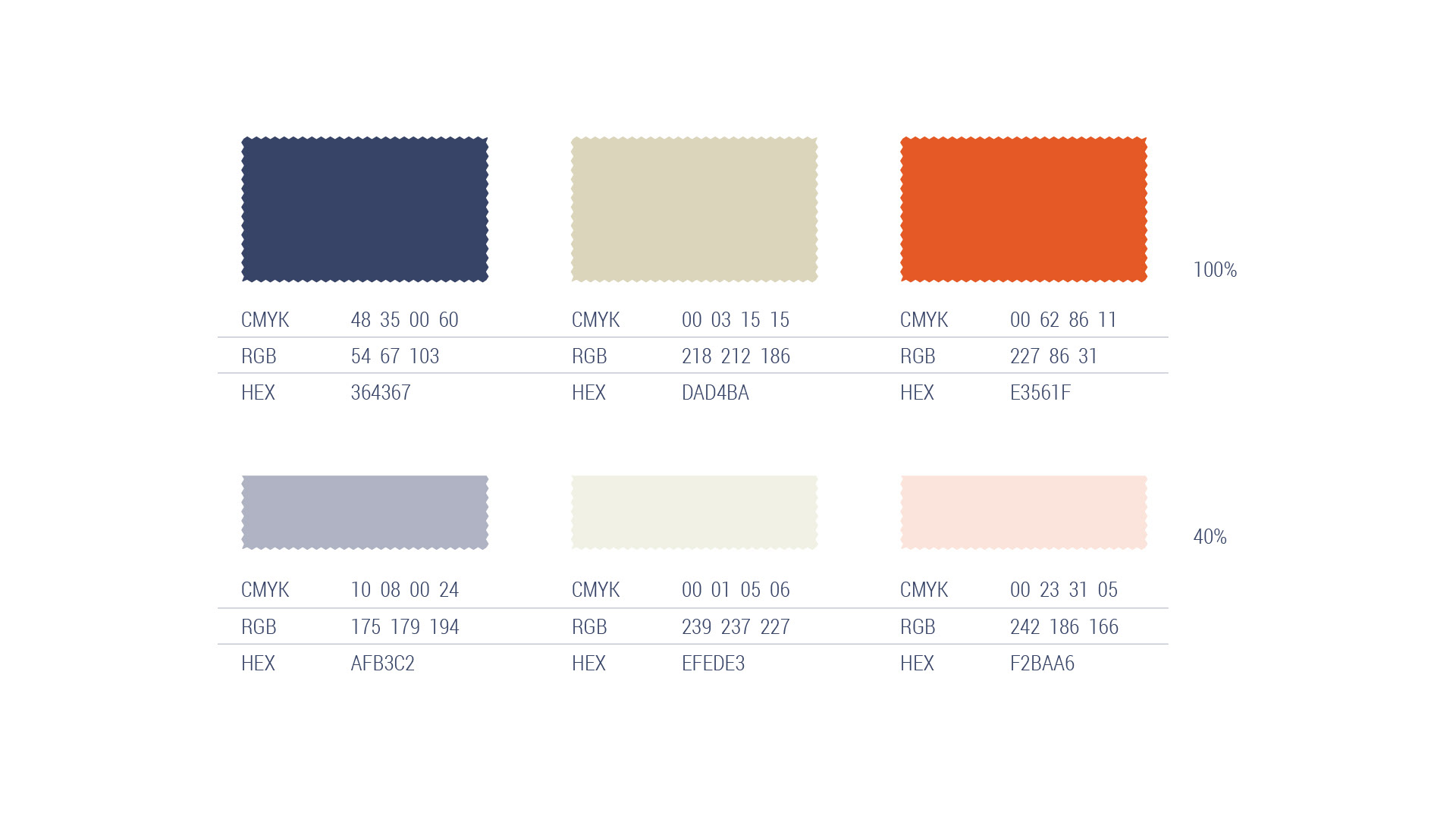
A modest color palette felt fitting for Clothier Connect’s identity. A classy deep blue, an earthy khaki and a sparsely-used fiery orange. Each of which can also be used at 40% opacity.

Patterns are greatly useful to express a brand’s personality. And with a brand made to be adopted by people who sell apparel, patterns like the popular herringbone were greatly appropriate to adopt.

A few marketing expressions were designed to set the visual style of communications. This magazine ad presents a simple sequence that points to power of being able to leverage one’s knowledge of their clients with the app. The takeaway, “They know because you know” implies a clothier can sell more effectively via use of this tool.
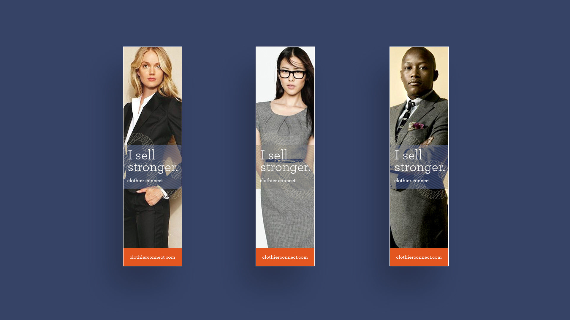
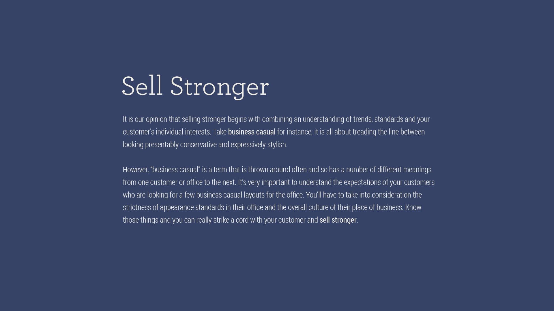
This series of vertical layouts can work for anything from a small web banner ad to convention booth panels. The message is meant to connect with the competitive spirit of the salesperson. “I sell stronger.” The implication, “I sell stronger than you, with Clothier Connect.”

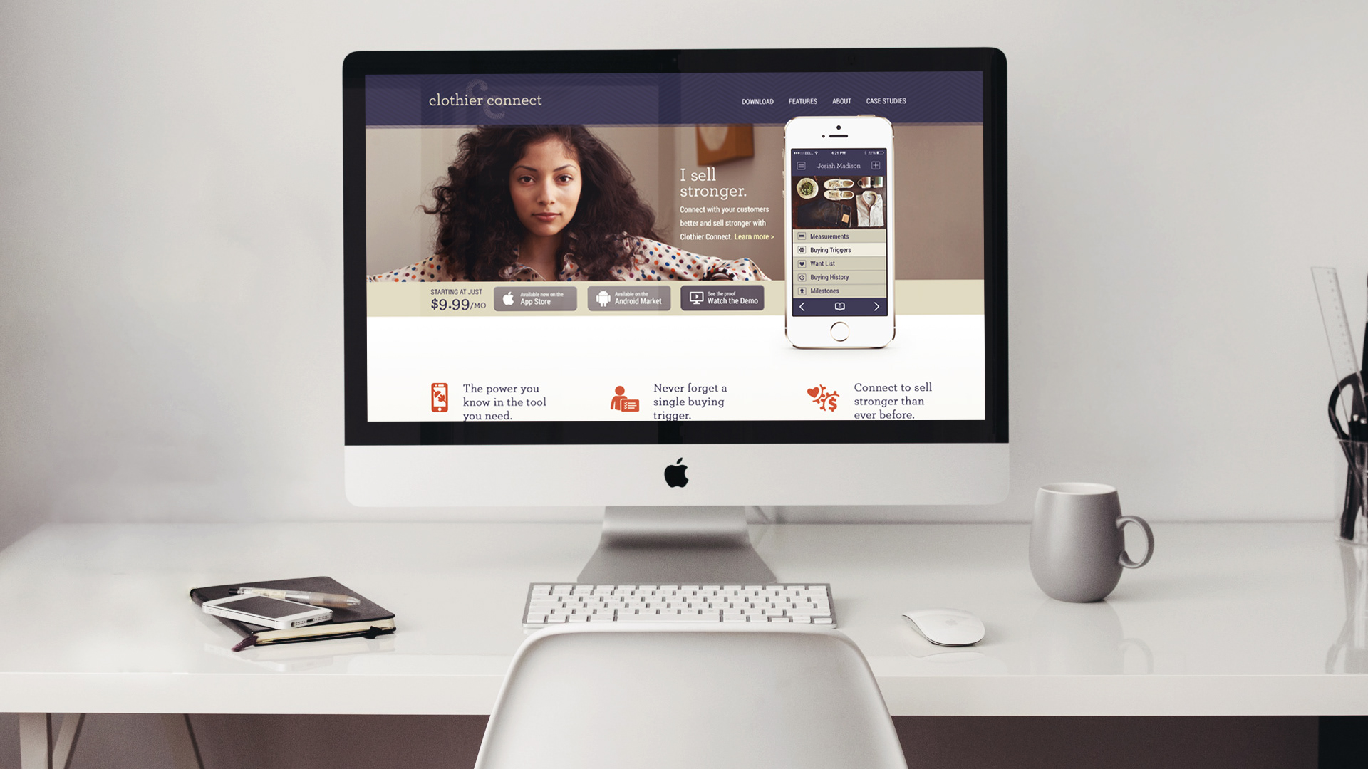
A brand’s identity must extend effortlessly to the web. Both of the above screens were designed by Thinkory. The second is an imagined, landing page for the app. The first is an actual page from what is Clothier Connect’s pre-launch interest signup website.