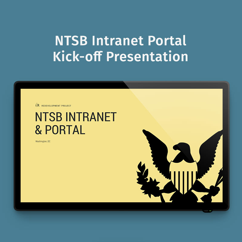
The National Transportation Safety Board (NTSB) is an independent US Federal agency charged with determining the probable cause of transportation accidents, promoting transportation safety and assisting victims of transportation accidents and their families.
Problem
The NTSB intranet portal neither inspired confidence or fostered productivity. I worked with a small team led by NTSB's acting CIO. Together, we realized the portal managed to be simultaneously visually overwhelming and functionally impractical. The NTSB portal had several pain points hindering productivity and rendering inert what could otherwise be a great asset for employee engagement at the agency.
Solution
Design an enterprise-centralizing, valuably useful and useable intranet portal to be built atop the pre-existing SharePoint environment. The new portal will offer an intuitive user experience backed by a redeveloped architecture of information and refined strategy for intranet-worthy content.
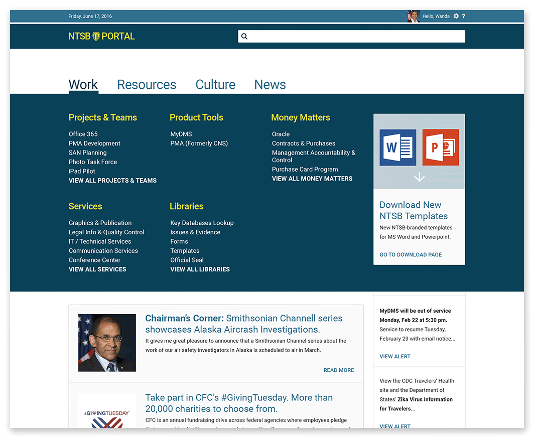
Preexisting design
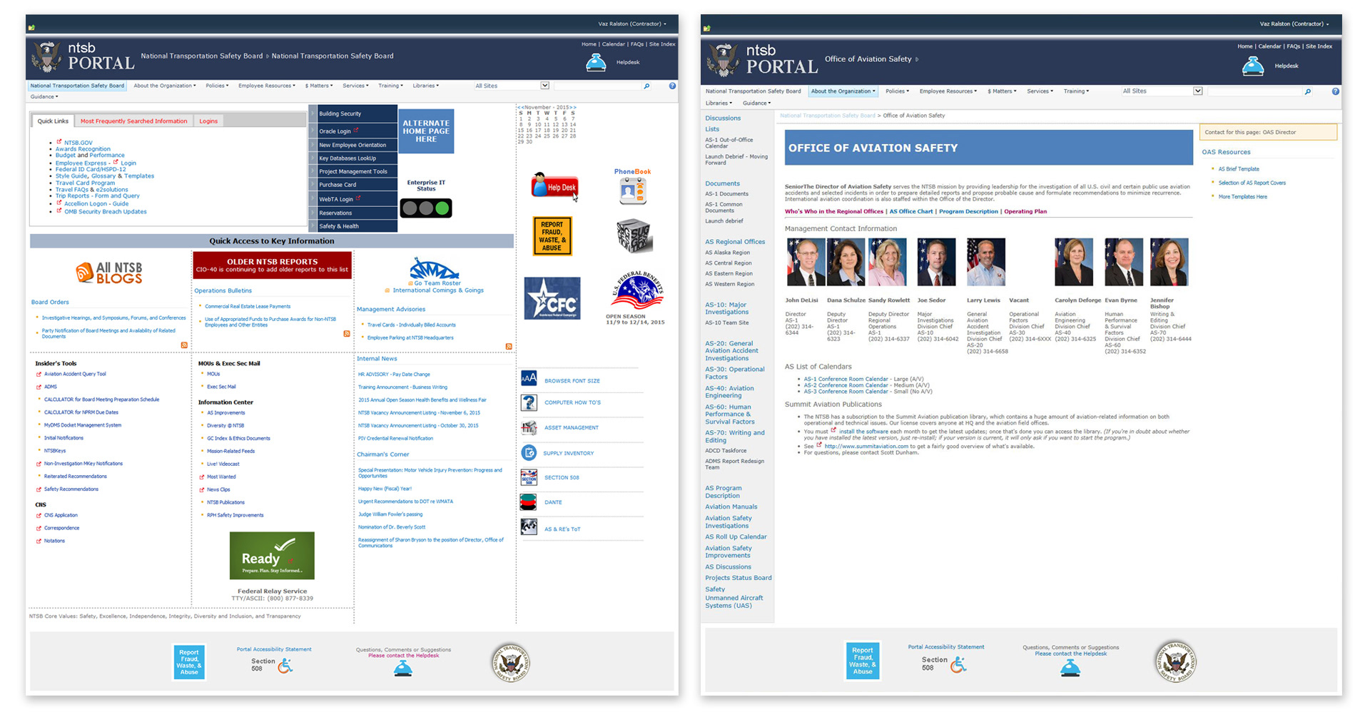
(Left: Home page. Right: Office landing page)
The NTSB portal—which was quickly and reactively developed to address a preceived need—had not been professionally reevaluated for several years. In the interim, this resource suffered the persistence of many well-intended requests run through few objective filters. According to users throughout the agency, the NTSB portal had become too difficult to navigate, too confusing to be considered useful and too unpredictable from page to page.
Preexisting sitemap
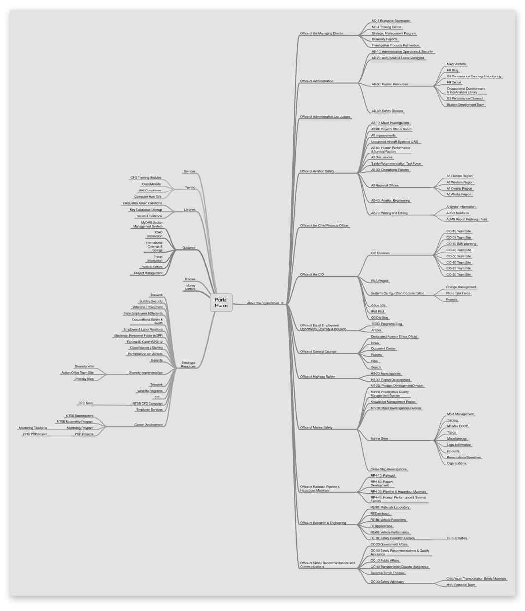
Using mind mapping software, Mindnode, I performed a study of the NTSB portal's overall structure. I discovered an uneven distribution of resources requiring too many illogical clicks to get from one point of interest to another. I also realized an absence of informative content that could offer employees a sense of what the agency and their peers were up to today. The beast of a map inspired the habit of relying on the public-facing ntsb.gov site for agency news, information and even some resources such as published recommendations published by NTSB.
Rethinking the navigation
Conversations and ideation sessions with the team about the purported uselessness of the cumbersome portal led me to believe in the validity of a concept for a new nav structure. Information and resources on the NTSB intranet could be organized into three high-level categories...
Work: The toolbox, hosting apps, forms and online tools commonly required by the majority of users to do their jobs on a daily basis.
Culture: The heart of the organization connecting its people with the values and policies that drive the expressions of the agency.
News: The morning paper, housing a collection of noteworthy information (blogs, announcements, industry news, safety recommendations, etc), current and archived.
Card sorting
The new concept for reorganizing the portal's content had to be tested. The client lead, however, was reluctant to initiate a feedback loop for fear of negative commentary. After illustrating the benefits of designing with users and not merely for them, I was allowed to organize and lead a simplified card sorting activity with senior leaders at NTSB.
The idea was to introduce senior leaders to user experience design and the team's approach to creating a better, more useful NTSB portal.

Participants were presented with two boards. The first, titled "I'm looking for..." hosted an unorganized collection of commonly used resources and notifications. The second, titled "So I'll check under..." featured three unexplained categories, "Work," "Culture" and "News." Without defining any of the categories, participants were asked to work together to sort each card (Post-It Note) into the category that seemed most fitting.
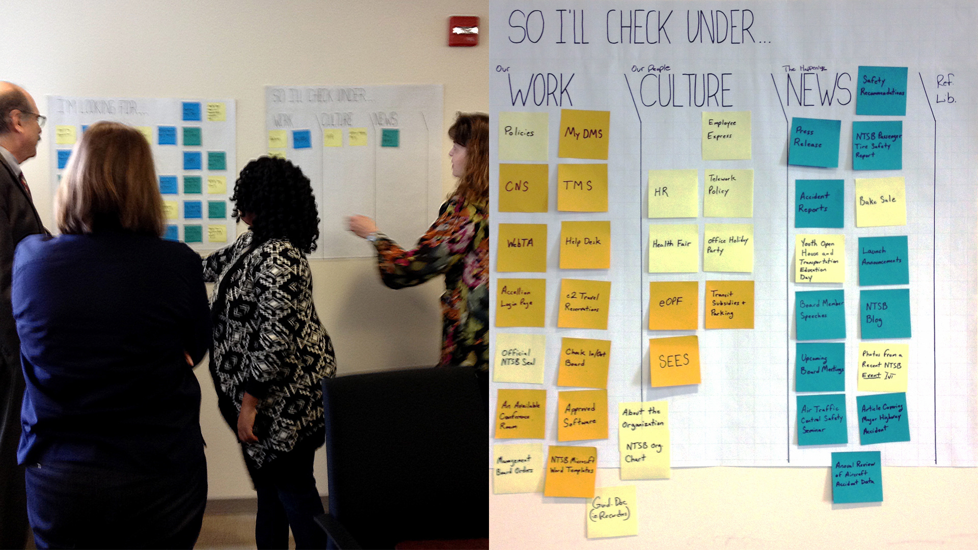
The simplified card sorting activity was a great success. It secured trust and buy-in from agency leadership while providing valuable insight to the team.
Agency-wide card sorting
Enlightened by the exercise and impressed with the thoughtfulness of the UX design approach, NTSB leadership agreed to allow the team to invite others to participate in the process. After some research, I decided to take the simplified card sorting activity online using Optimal Sort which also provided great tools for surveying participants before and/or after the card sorting portion.
Over a 7 day period, 34% of the agency participated in the online card sorting activity—a greater response rate than any senior leader had seen in previous agency-wide surveys. Of those, 60% expressed a desire for better navigation and search. Several mentioned wanting to be aware of agency activities replacing the deluge of flyers posted throughout the office.
In the end, perhaps the most encouraging statistic to NTSB leadership and the team was the 85% of respondents who agreed to be active participants in the UX design process going forward.
Proposed sitemap
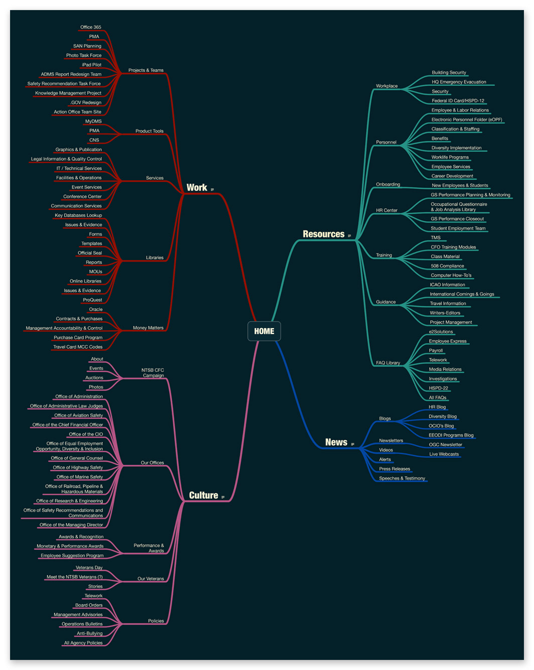
With users lending insight that helped us validate our concept for improving the organization of tools and information on the NTSB portal, we returned to the ill-proportioned sitemap and refined our approach. We added a new category to our solution...
Resources: A collection of organizational assets giving NTSB personnel quick access to information pertaining to career development, training, benefits and more.
With the four top-level nav categories established, and the data from the agency-wide card sorting activity, I returned to Mindnode to construct a new map for the information architecture of the NTSB portal. The new sitemap was refined through several iterations and conversations.
Wireframe sketches

With pencil, graph paper and insight, I began generating several wireframe sketches of the new NTSB portal design and experience. Seen here are sketches for the portal's home page and an office landing page.
Top of mind in the rough sketch process was creating an easier way for users to find what they're looking for on a daily basis. While that need must be served, so too must the need to serve useful information to the user about their agency, their office within the agency and their co-workers around them.
Digital wireframes
Once ideas were exhausted on paper, I began illustrating the vision for the NTSB portal's new design digitally. I kept the process simple using Photoshop artboards and Adobe Libraries to iterate on the structure of key portal pages.
A major concept I developed through wireframes and proposed for the redesign of the portal was a set of customizable components called "My Toolbox" (top right of each page) and "My Tool Belt" (bottom of each page).
Each component allowed the user to create and manage their own list of links providing direct access to the tools and resources they use most. Previously, no such functionality existed on the portal. Users were only offered outdated, static collections of "frequently visited" links. While the vast majority of the portal's pages would be governed by a network of content managers, My Toolbox and My Tool Belt put control and access in the hands of the individual user.
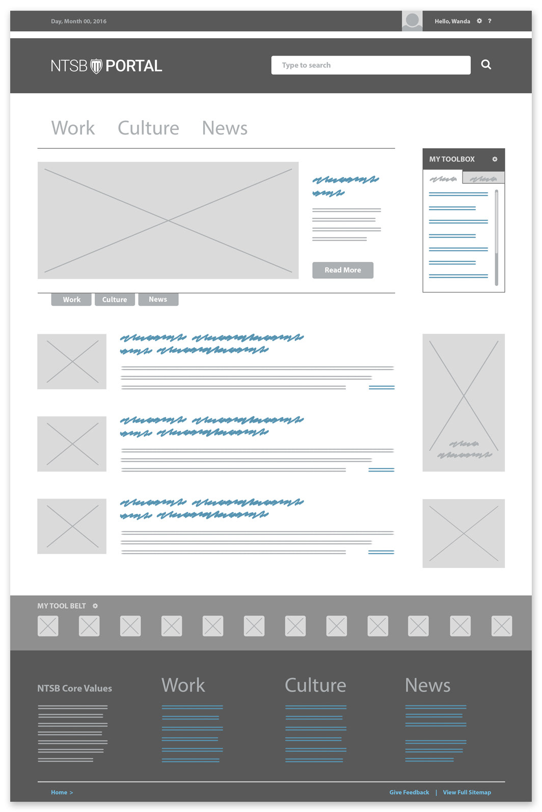
Home page
The new structure of the portal home page would take its cues from the design patterns of internet sites users frequented daily. A better visual hierarchy would guide the eye with more sensible content organization. A rotating header banner would feature three points of interest pertaining to each navigational category. Photography would also be introduced to the portal to increase the visibility of desirable content and agency notifications.

Navigation menu
Each category of the new navigation would open into a mega menu of logical subcategories making it easier for users to find what they're looking for, where they're looking for it.
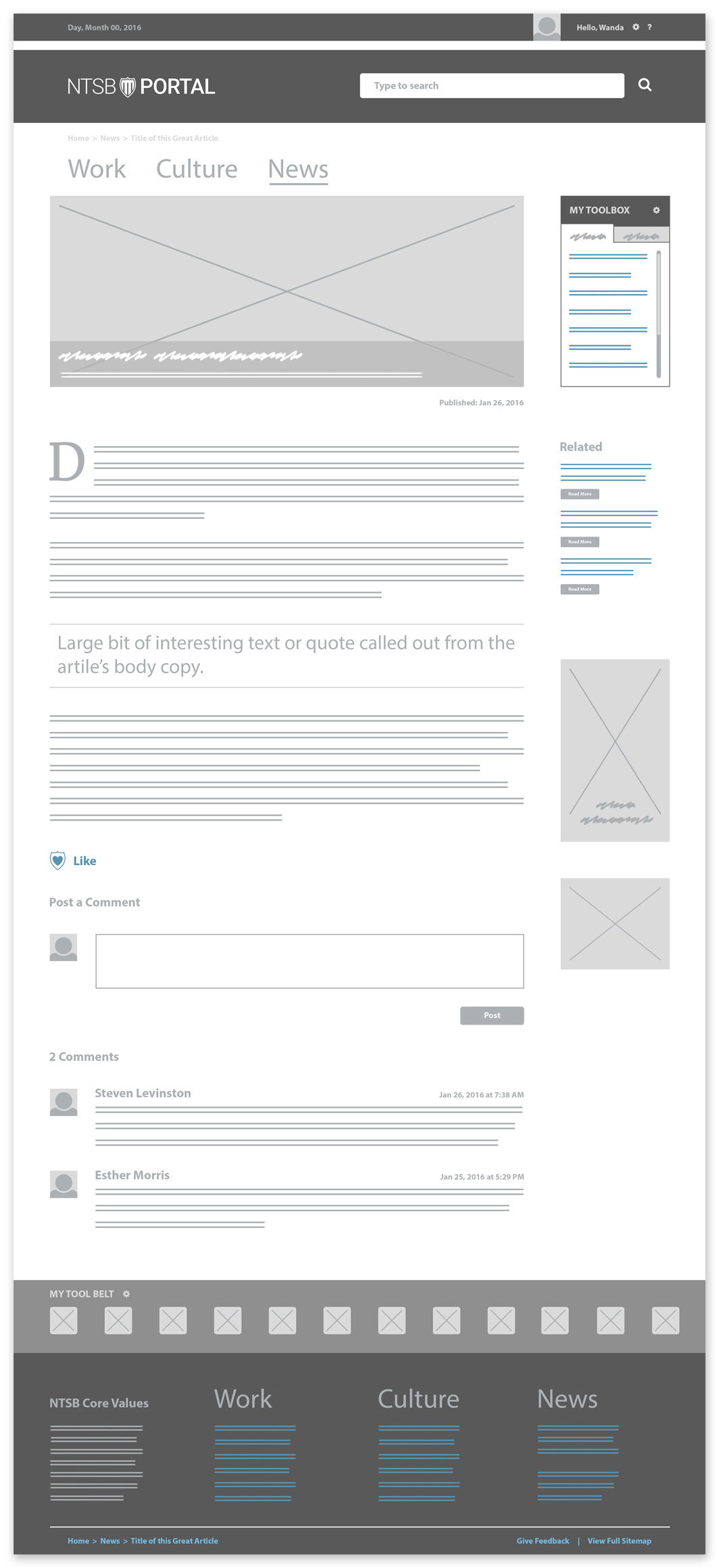
Article pages
A new content strategy created an opportunity to publish blog-style content and news within the portal. An article page, purposed to host long copy content, would invite conversation within the agency and among co-workers negating the need to rely on the ntsb.gov website for such information.
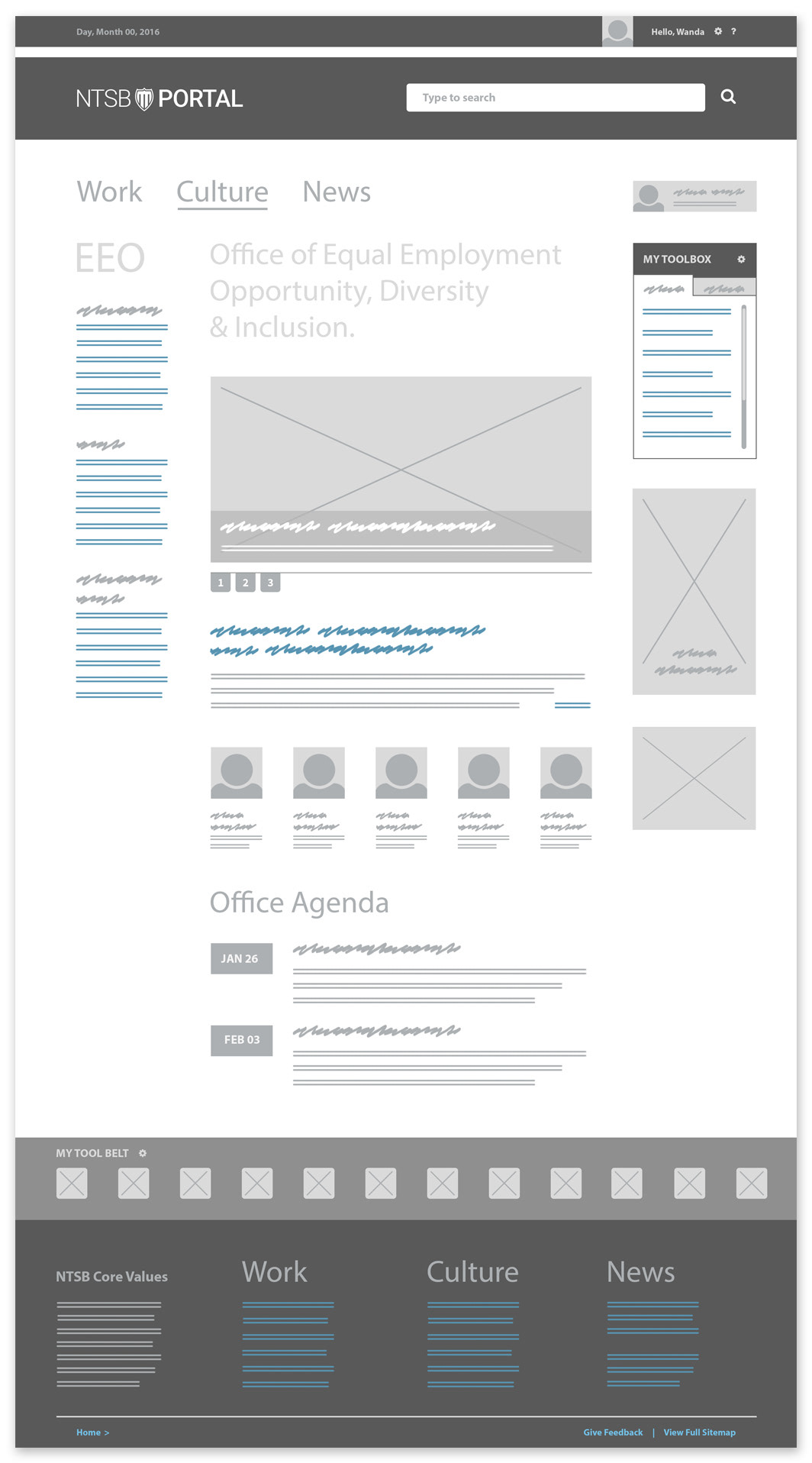
Office landing pages
NTSB is made up of several units called "offices." While the portal home page should serve to centralize the enterprise, I proposed members of each office be given the opportunity to inform and equip themselves with content and resources specific to their office. Beyond an org chart and mission statement, office landing pages would offer news articles, event listings and project workspaces that better connected employees with their world of work.
Visual design
With a greater idea of where the design was headed, I needed to understand how the concept would work with content closer to reality. I produced mockups to help the team better visualize and discuss the ideas and solutions I was proposing. The visual design process was a continuous effort to validate and iterate on our ideas for the new NTSB portal.
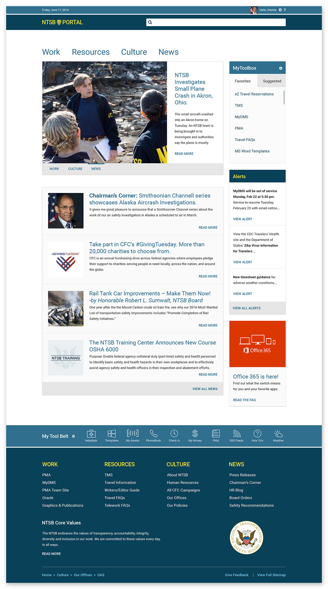
Home page
Several elements evolved from wireframes to visual design, but creating an experience that made it easier for NTSB users to find what they're looking for was always top of mind. The category navigation, MyToolbox and My Tool Belt were all concepts that held strong through reviews and iterations.
I developed a new concept to the home page, Alerts, inspired by the deluge of emails employees receive daily regarding outages of resources and applications. These emails were so frequent that most employees would simply ignore them. The Alerts box will feature the three most recent notices with access to older notifications. With time, this portal feature would ease the dependency of all-hands emails to send similar notices to the entire agency.
Navigation
Fleshing out the navigation's visual design revealed opportunities to feature various types of attention-winning media. Some menus would feature static text ads or small clickable banners while others could host muted video clips. Overall, the function of each mega menu is to divide NTSB into four main parts and step users into an organized area of interest as they explore the portal's navigation.
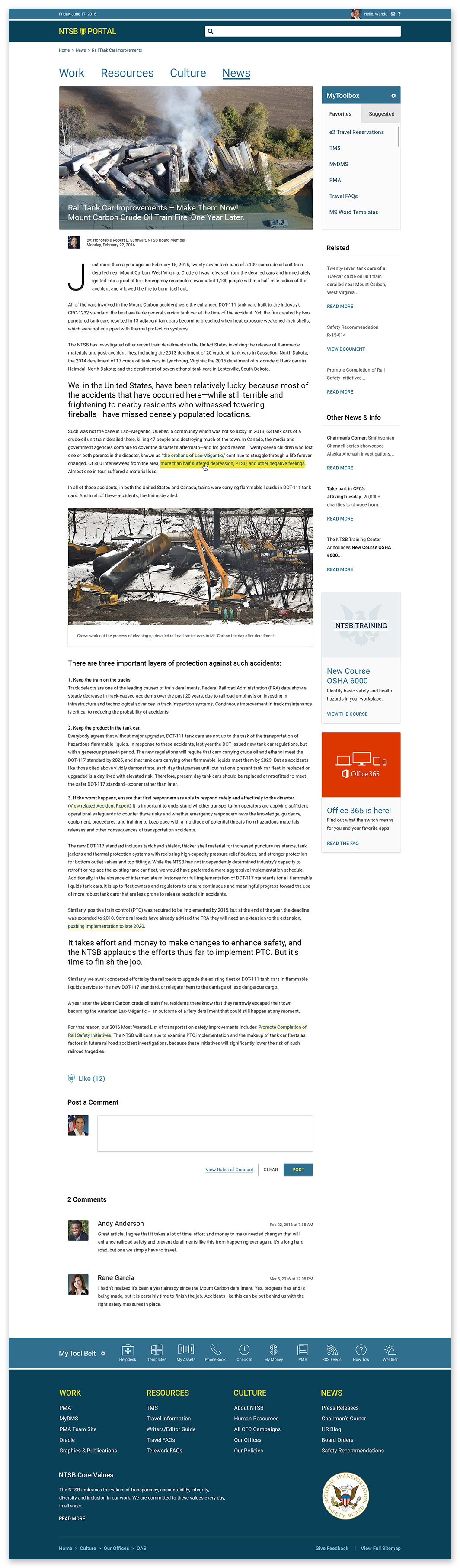
Article page
Wanting to demonstrate the visual design of the new article page, I mocked up a real-world blog post written by one of NTSB's board members, the Honorable Robert L. Sumwalt. The lengthy article provided an extreme example of how the portal's new visual design would present long content in a way that was scannable and easy to consume.
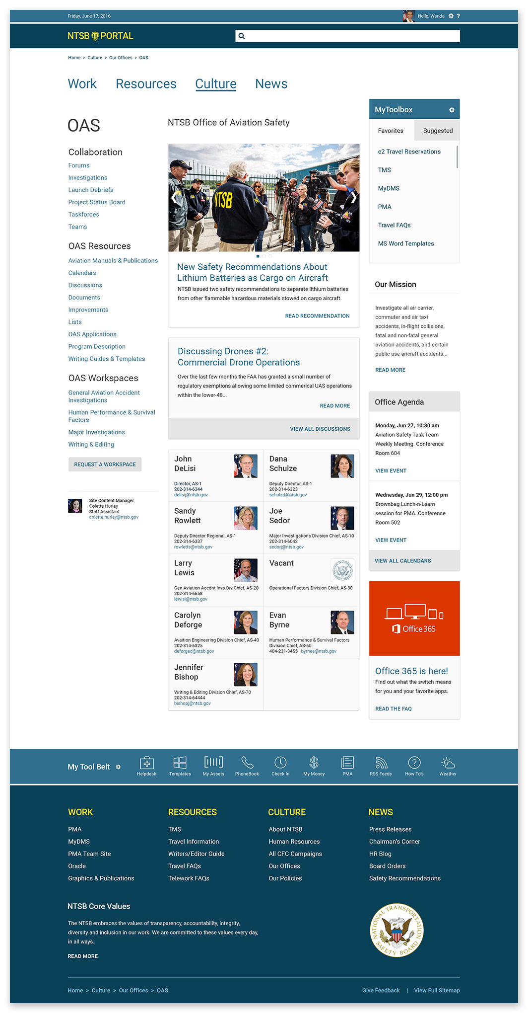
Office landing page
Offering more value to employees, the office landing pages of the NTSB portal would provide quick access to divisions, team workspaces and informative articles unique to each of the agencies offices.
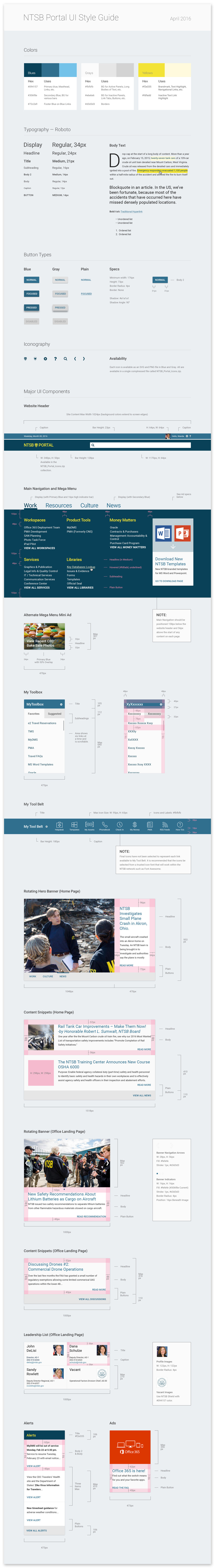
Visual design style guide
Nearing the end of my allotted time on the project, I produced a set of standards for the NTSB portal's visual design. Unexpected budget restraints made it uncertain the caliber of front-end SharePoint developer the agency would be able to secure. Knowing this, I aimed to equip the agency to reproduce in code what we worked so fervently to create in strategy and style.

Wanda Briggs
Acting Chief Information Officer
Office of the CIO
National Transportation Safety Board
Office of the CIO
National Transportation Safety Board
Thanks, Ralston, for providing such creative skills. You have left the NTSB in good standing by facilitating community input and your ability to grasp their needs. Your professionalism and demeanor aided in taking the stakeholders to a whole new level of engaging change.
Much success.
Project stats
Length of project:
7 months
7 months
Skills used:
UX Strategy, Content Writing, Graphic Design, Ideation, UX Design, UI Design, Client Relations
UX Strategy, Content Writing, Graphic Design, Ideation, UX Design, UI Design, Client Relations
Skills acquired:
UX Project Management, Digital Mind Mapping, Online Card Sorting, Video Presentation Production
UX Project Management, Digital Mind Mapping, Online Card Sorting, Video Presentation Production
Tools used:
Mindnode, Optimal Sort, Illustrator, Photoshop, Keynote, Powerpoint, Premiere, Audition, Quicktime
Mindnode, Optimal Sort, Illustrator, Photoshop, Keynote, Powerpoint, Premiere, Audition, Quicktime