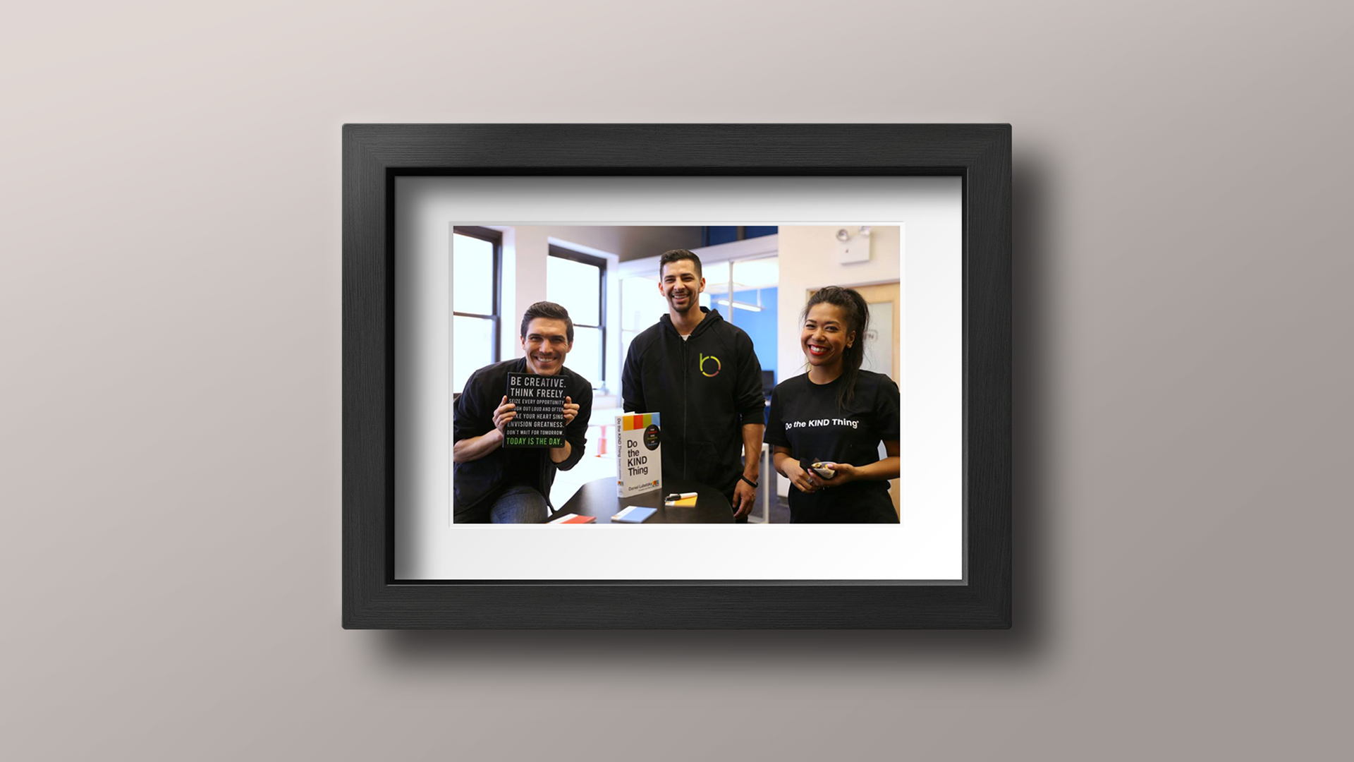
The largest social impact community in New York City, Be Social Change helps people across industries find and do purpose-driven work, create supportive networks, and lead sustainable lifestyles.
The company organizes engaging events for its many members year-round including professional development classes, social entrepreneurship workshops, networking events, and panel discussions.
The Problem
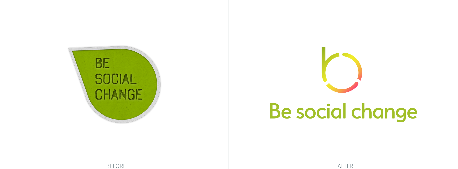
Be Social Change founder, Marcos Salazar, engaged my brand design consultancy, Thinkory, to work through refining his company's brand strategy. Our next challenge to face together was more than the redesign of an existing logo. With his company moving to a valuable membership model, we needed to signal new beginnings for the community and its members with a mark of identification that celebrated continuous change and personal growth.
The mark needed to fuel recognition, build reputation, and help win the trust of existing members, future supporters, and strategic partners. A mark that’s equally meaningful, presentable, and functional.
The Thinking
What if the logo told a story?
We realized a symbol for Be Social Change could be as storied as it is simple. We considered what story was worth telling and landed on a reinforcing idea: Journey.
The Concept: Journey
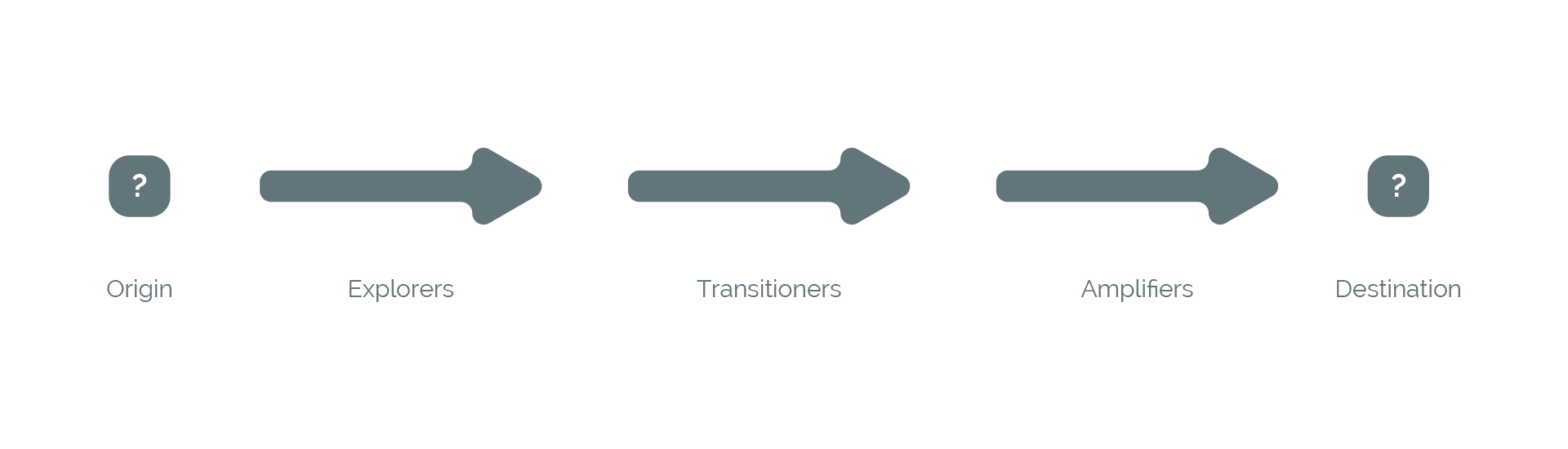
We considered how people will move through the organization— beginning as one thing, eventually becoming another. We saw the journey’s validity in professional, entrepreneurial, and personal contexts.
But we also noted another challenge – origin and destination. We made it a goal to solve for both – if possible – in a storied and energizing symbol.
Exploration
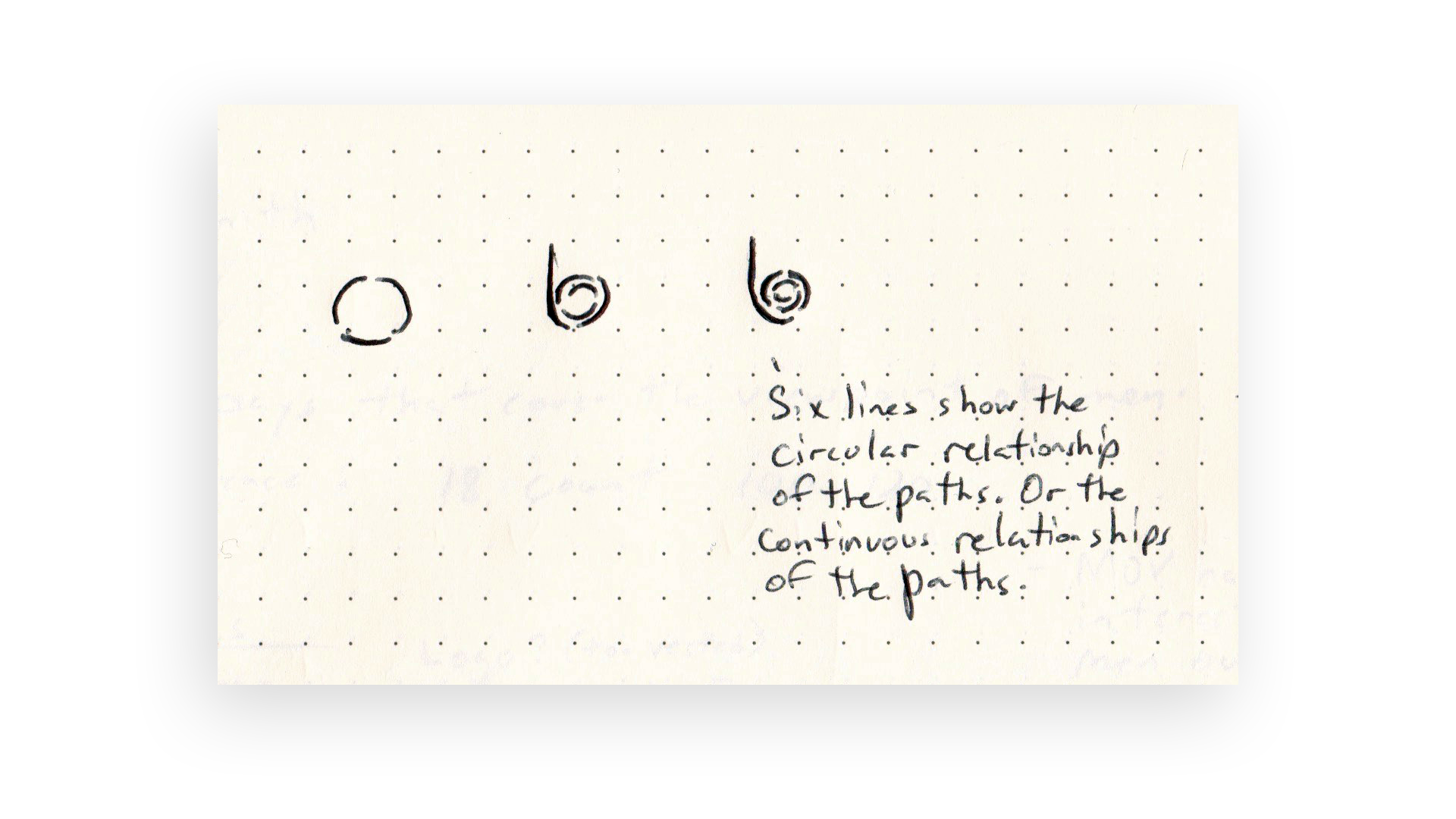
With a collective grasp of our challenge and an appreciation for the opportunity at hand, we began exploring lines and shapes with rough sketches.
Quickly, I found my sketches zeroing in on using the bowl of a lower case letter "b" to somehow tell the story of the personal and professional journey a Be Social Change member takes through the company's offerings.
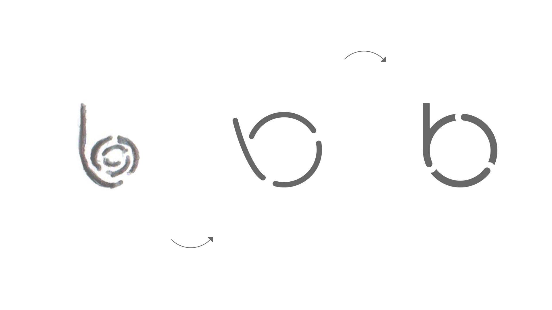
Iteratively working through sketches and digital refinements we continued to evolve the concept. Ultimately, we crafted a symbol that could celebrate the spirit of Be Social Change, the strength of its community, and the shared story of its people.

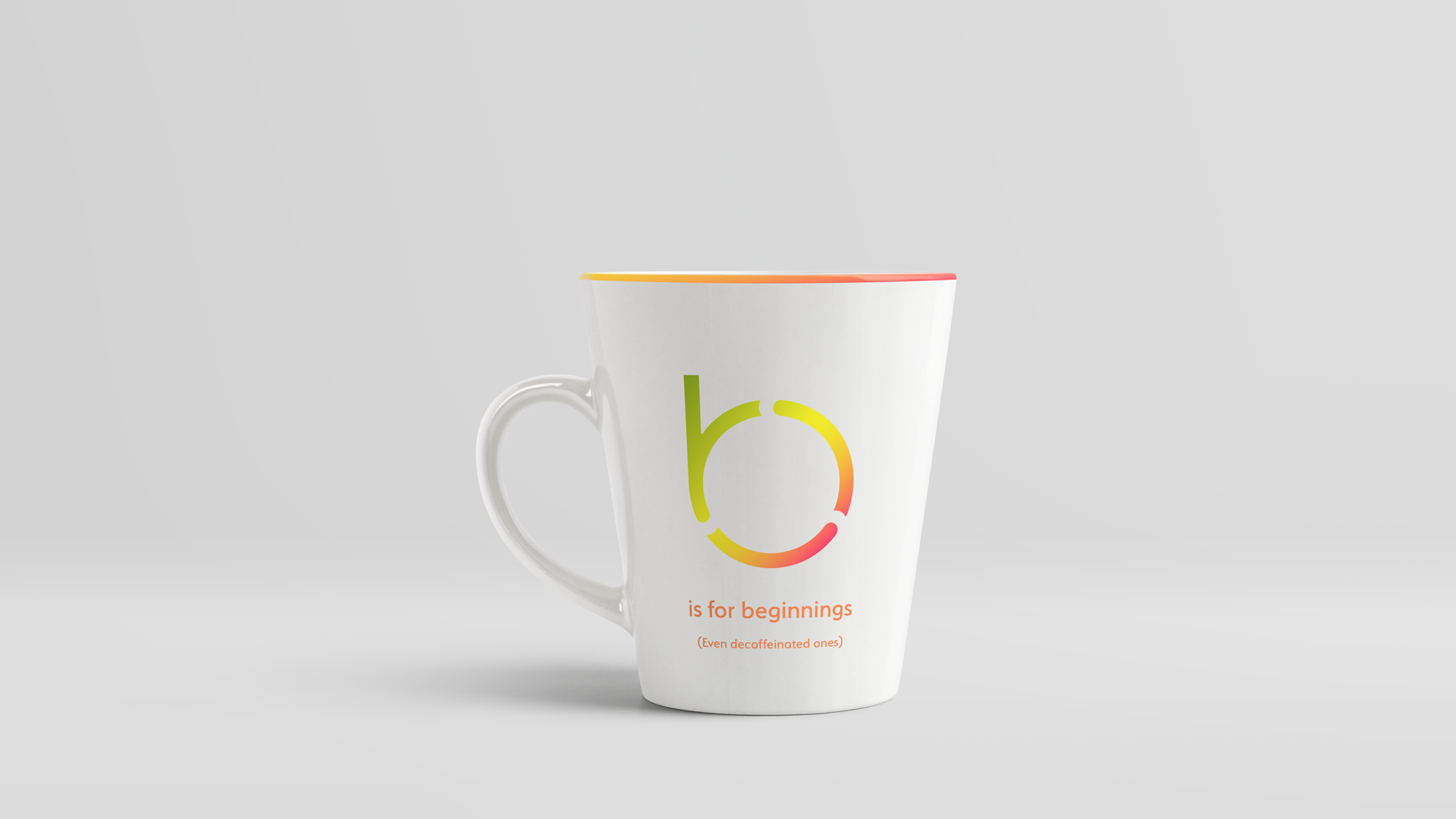
Simple, strong and distinctive. The new Be Social Change symbol is full of meaning and character without impeding its primary job: to quickly identify an amazing organization and call to mind transformative experiences.

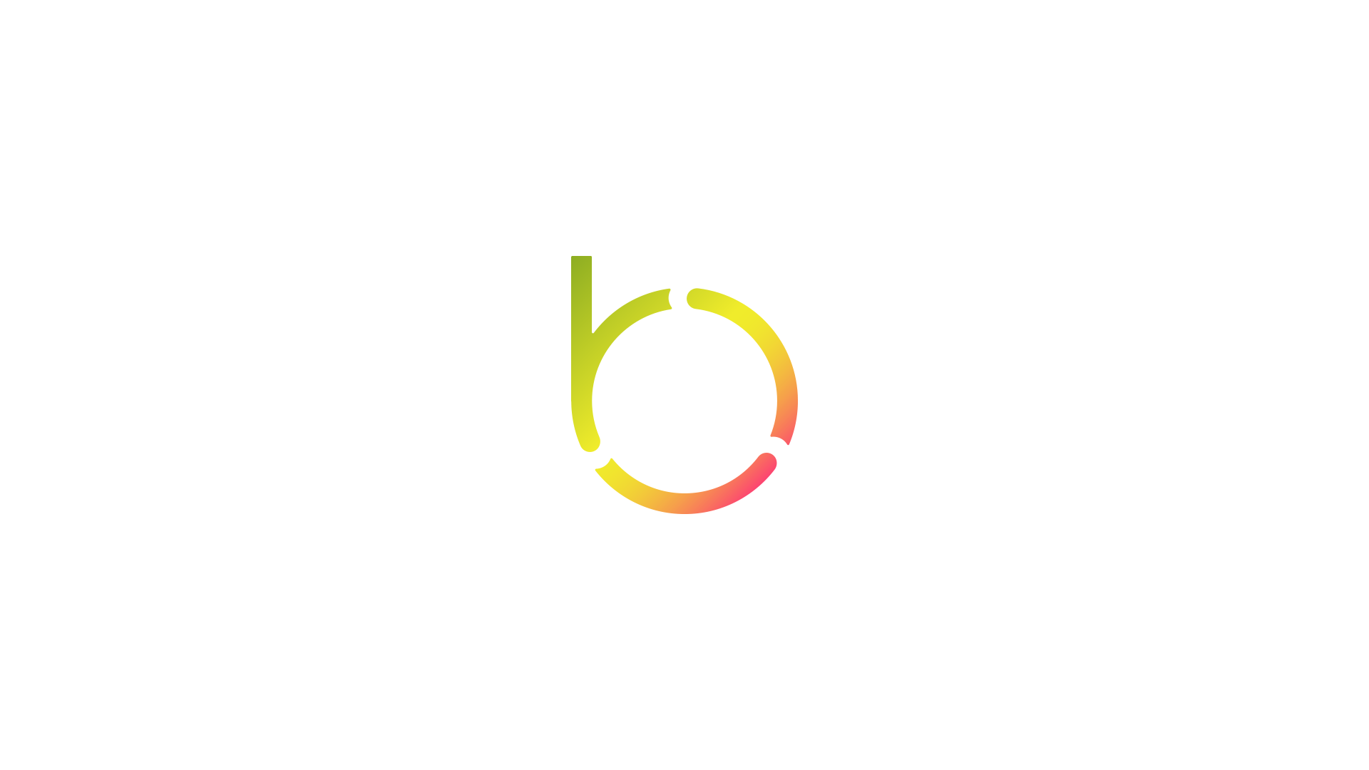
The Symbol's Color Story
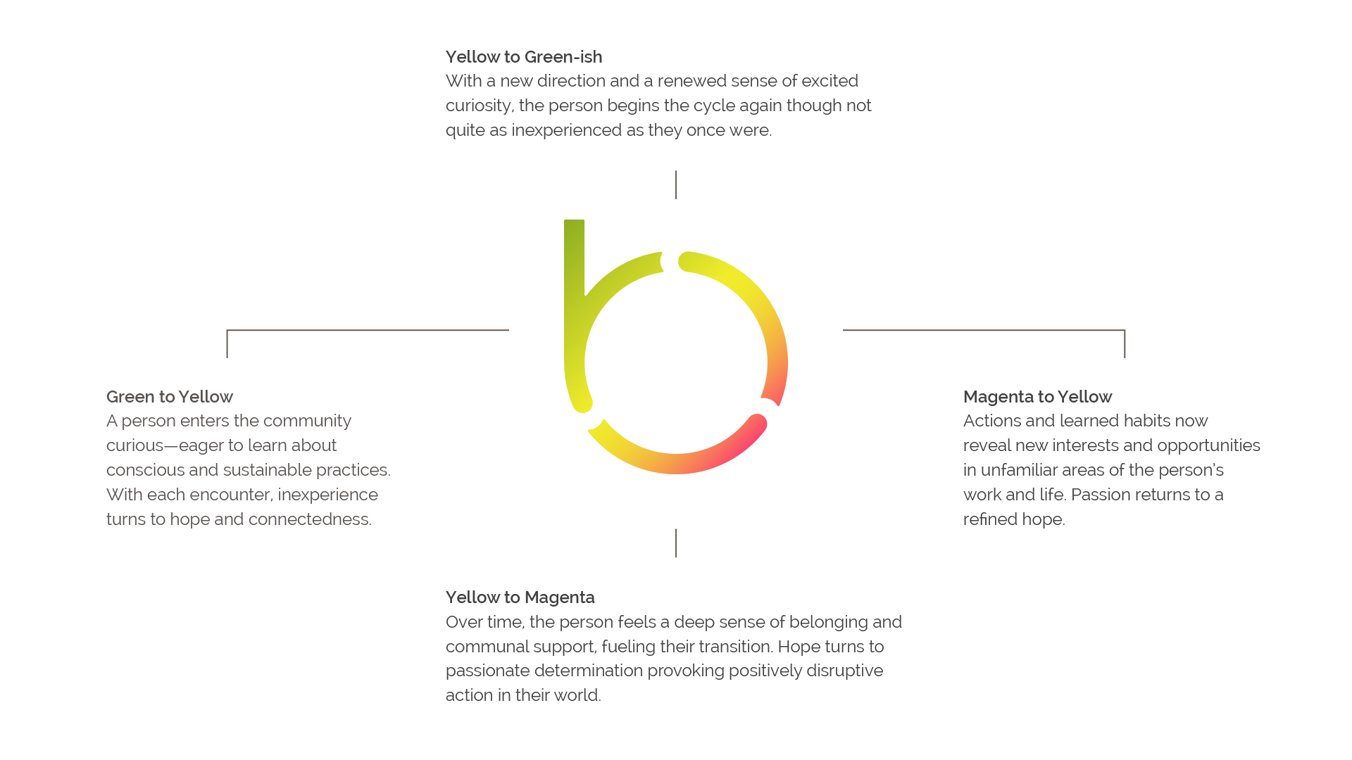
Each color and color transition tells a portion of the story common to many Be Social Change members. My favorite part? The top-left merged section when an experienced member's renewed sense of excited curiosity meets the eagerness of a newcomer and they find themselves embarking on a very similar journey.

It’s said the triangle might be the strongest shape in nature as it evenly spreads any added force through all three sides. The shape’s incorporation into the symbol serves as an internal reminder to the Be Social Change team that the company’s capacity, capability, and raw strength comes from its community.
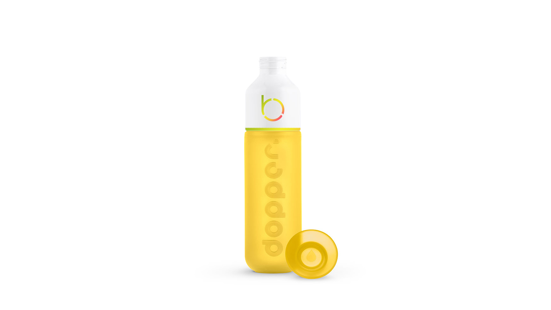
(And the symbol will look pretty good on a Dopper Original Hello Yellow. Dopper is a great Netherlands-based social enterprise with a US office in Brooklyn, NY. They're a regular supporter and strategic partner of Be Social Change.)
The Name is the Message
After much exploration and contemplation, no tagline could compare to the vigor and prompt of the company's name alone. Indeed the name is the message. And to reinforce that fact in the wordmark, the company name is displayed in sentence case suggesting that it isn't just a title, but as a statement.
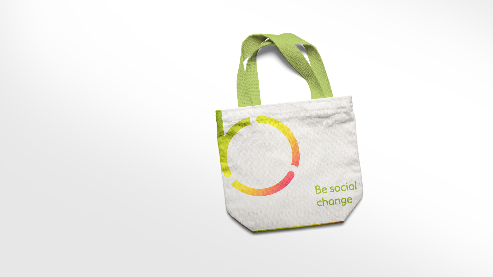
A statement that Be Social Change members can make all over NYC as they shop and enjoy member-exclusive discounts.
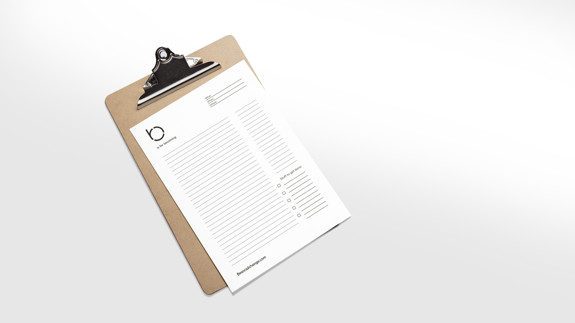
A statement that inspires statements that inspire change. Statements like "b is for becoming" that we placed on a series of note sheets we designed for members to use at Be Social Change's many classes and workshops.
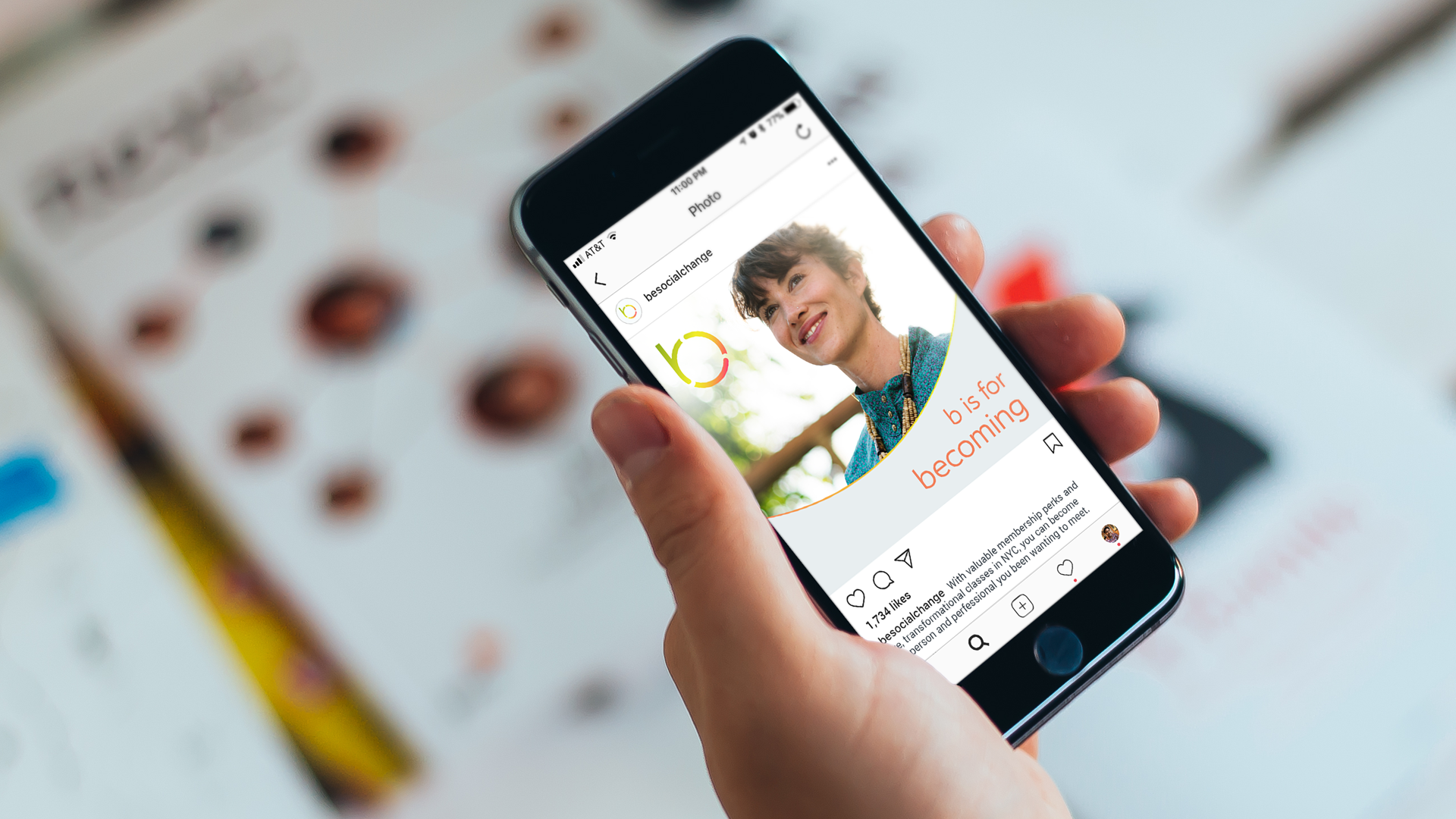
Even Be Social Change's social media channels reap the benefit of its statement. The words inspire encouraging expressions that can attract those who would discover and feel a sense of belonging to this purpose-driven community.
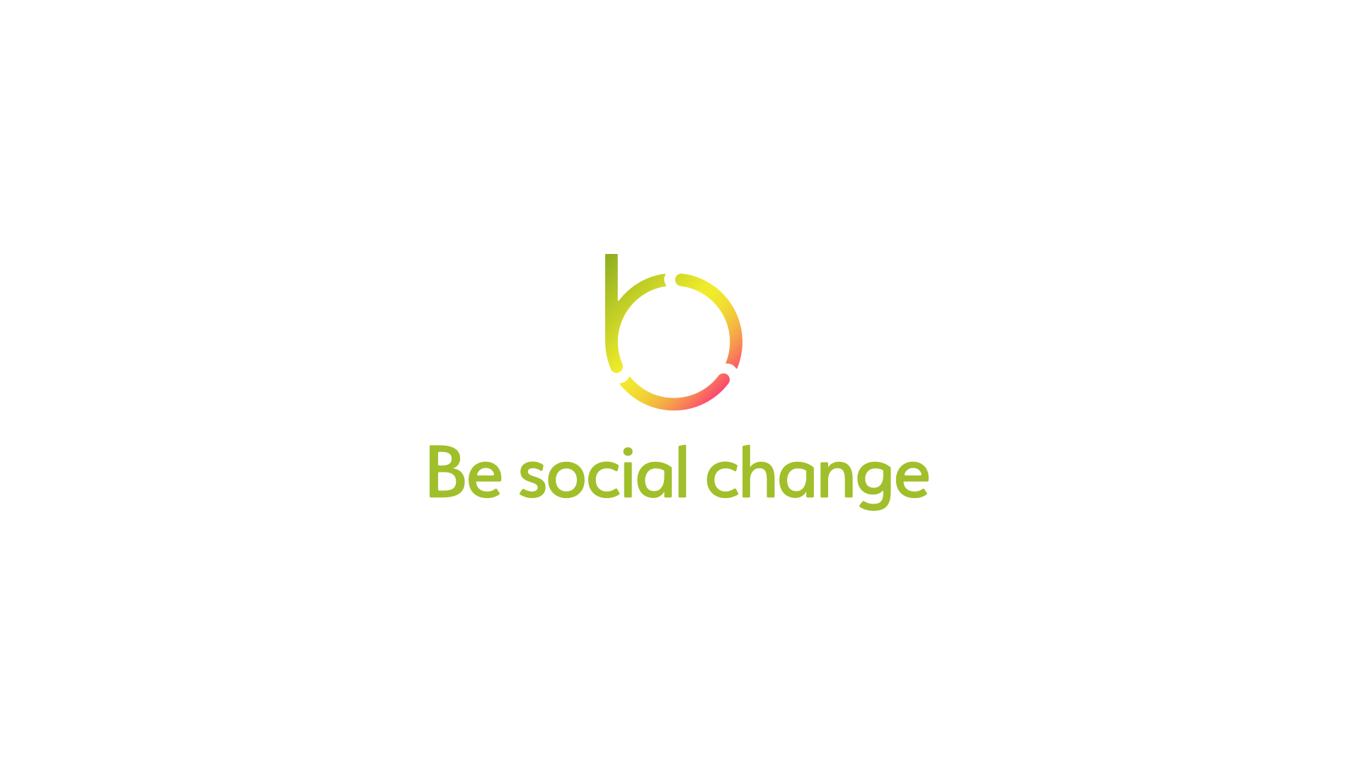
Combined, the new Be Social Change symbol and wordmark create a distinctive, storied identity that celebrates and encourages personal journeys through positively impactful change.
Meaningful change that people will kindly and proudly share with everyone they know.