YP is a leading local marketing solutions provider in the US dedicated to helping local businesses and communities grow. Formerly AT&T Interactive and AT&T Advertising Solutions, YP launched in May 2012, bringing the two companies together.
Problem
AT&T was selling two business units that would combine to become YP.com. In a short span of time, and in secrecy, a visual design had to be established for YP's new intranet home page to coincide with the company's launch bringing together working cultures from Atlanta, GA to Glendale, CA.
Thinking
Design the new intranet home page to embrace big change, celebrate new possibilities and welcome fresh ideas. The page should be culture agnostic establishing new ground for employee engagement while inspiring optimistic self-expression.
The name
There were several names considered for the new intranet. I decided on "YP InterConnections" for the implication of its meaning. Through the strategic use of engaging copy, imagery and media, the intranet would serve to connect two worlds (and the many people in them) with one another.
YP InterConnections

With a new organization spread across the country (literally, from Georgia to California and regions between), it was important to me and the communications team that the intranet home page mark the changes upon us all with excitement and optimism. I Adopted the new YP brand colors and shed the AT&T blues. I also focused on creating a highly scannable page in consideration of users who would be sifting through a host of new content looking for day-one answers.
I also developed new content types for the YP intranet home page including "Believers," "Recognition" and a quick message from the new CEO. Overall, the page was given a more casual tone and youthful feel. Not previously possible with AT&T.
Multi-feature banner
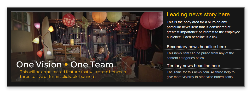
To help new users navigate all the new information on the home page, I created a three-feature rotating banner. The banner offered vibrant imagery, easy to find headlines and content preview snippets to the user—each activated by hovering over a headline as opposed to auto rotation.
Media and ads
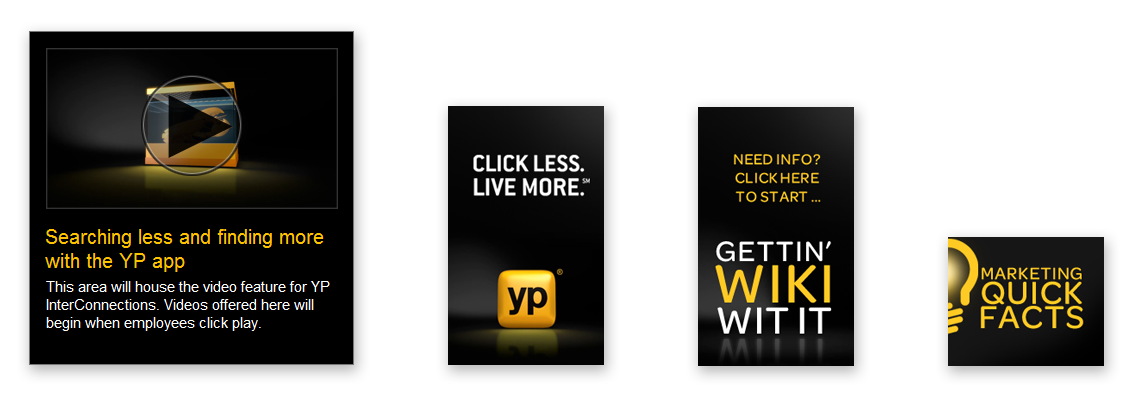
I developed a few other new content types for YP InterConnections: video and column ads. Each helped employee users quicken their assessment of what's new and noteworthy throughout the company. The media player could either play content in place on the home page, or be opened to its own page where more of a description would be offered along with a comment section for reactions and discussion among employees.
Result
A completely remodeled intranet home page inspired by the emergence of a new working culture. The visual design enjoyed enthusiastic buy-in from key executive leaders and was an important contributor to the success of YP's day one launch. And, last I checked, the design and concept continue to be vital to effective internal communications at YP today.
Project stats
Length of project:
1 month
1 month
Skills used:
Content strategy, Content writing, Graphic design, Ideation, Naming, UX design, UI design
Content strategy, Content writing, Graphic design, Ideation, Naming, UX design, UI design
Skills acquired:
Developing communications strategies while under NDA restrictions
Developing communications strategies while under NDA restrictions
Tools used:
PhotoShop, Illustrator, Adobe Media Encoder, Premiere
PhotoShop, Illustrator, Adobe Media Encoder, Premiere