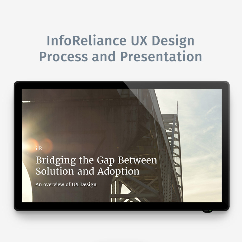
Impact College, a project of 42 Strategies, hosts e-learning training courses on the skills needed to build a better world. Partnering with leading organizations providing content for the transformative online platform, the company distills lessons into modular, impact increasing training to help solve the world’s most pressing problems.
(OLD LOGO)
The Problem
The company's name, "Impact College" carried misconceptions that led people to assume the firm itself was a teaching institution. The logo was also less than storied holding no significant meaning for the company.
Seeking funding, anticipating continued growth, and gearing up for more targeted marketing efforts, the company's founder, Dipanwita Das, approached my brand design consultancy, Thinkory. We partnered together to refine Impact College’s brand, redevelop its name, and completely redesign its core brand identity.
New Name
After a period of brand introspection followed closely by an intense naming effort, we retired the name "Impact College" and renamed the company "Sorcero." Growing to become a company capable of creating wondrously masterful learning experiences out of otherwise mundane training content, the name was inspired by the concept of a “sorcerer.” It also plays on the word “source” as in source code or source content, and borrows from the end sounds of “studio” and “video.”
Identity Design Thinking
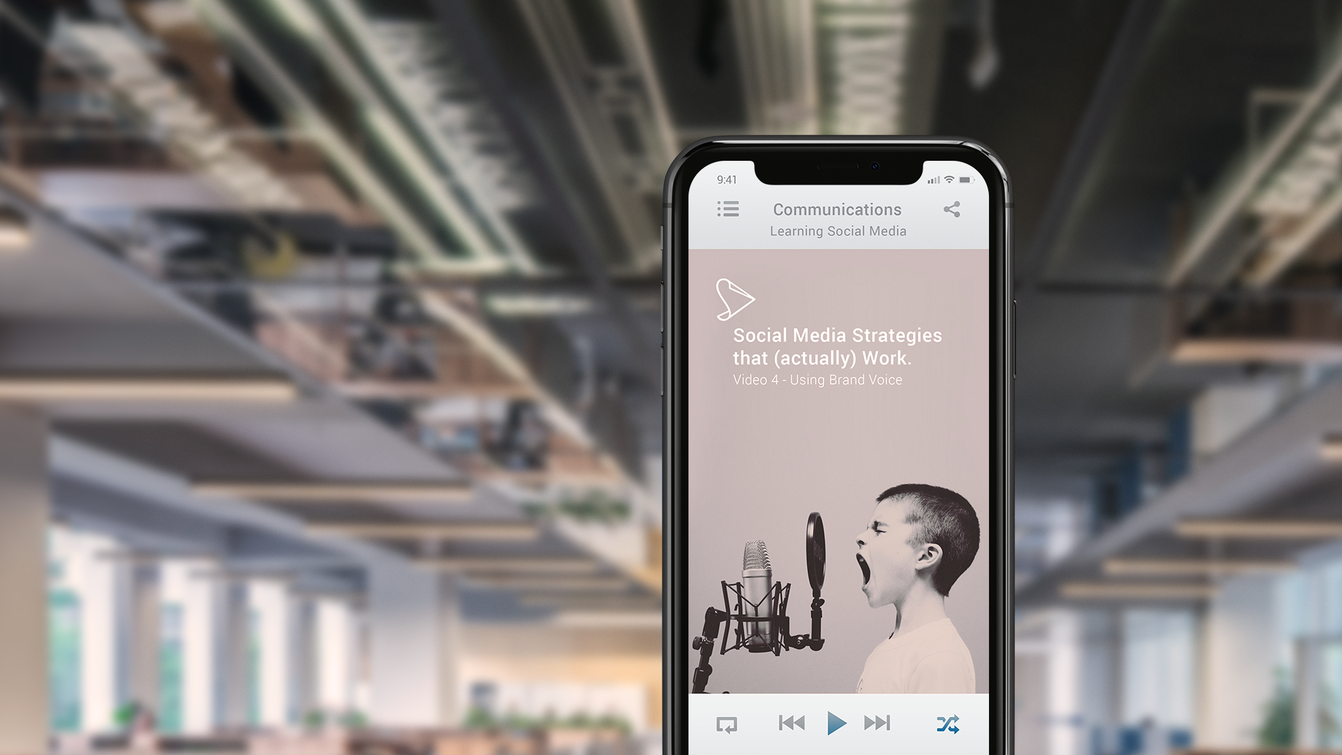
For the company's visual identity, we wanted to point to Sorcero's ability to transform an organization's unique training practices into highly engaging online learning experiences. Artful, captivating content that people want to spend time watching.
We agreed the solution should feel familiar and optimistic while portraying a confidence in the ability to create premium content.
I also wanted to make sure any future expressions of the brand could work in concert to reflect the ideology and character of the organization as it evolved.

Mood Board
To visualize the creative brief and capture the mood and feeling the brand should evoke, I worked with Sorcero's founders to create a mood board.
These textures, objects, and swatches used imply a sense of high touch, hand-crafted quality. Some objects speak to a measure of traditional craftsmanship and are juxtaposed with others that point to technological advancements. Overall, the mood board purposed to portray a harmonious unification of the past and the future in the present.
Exploration
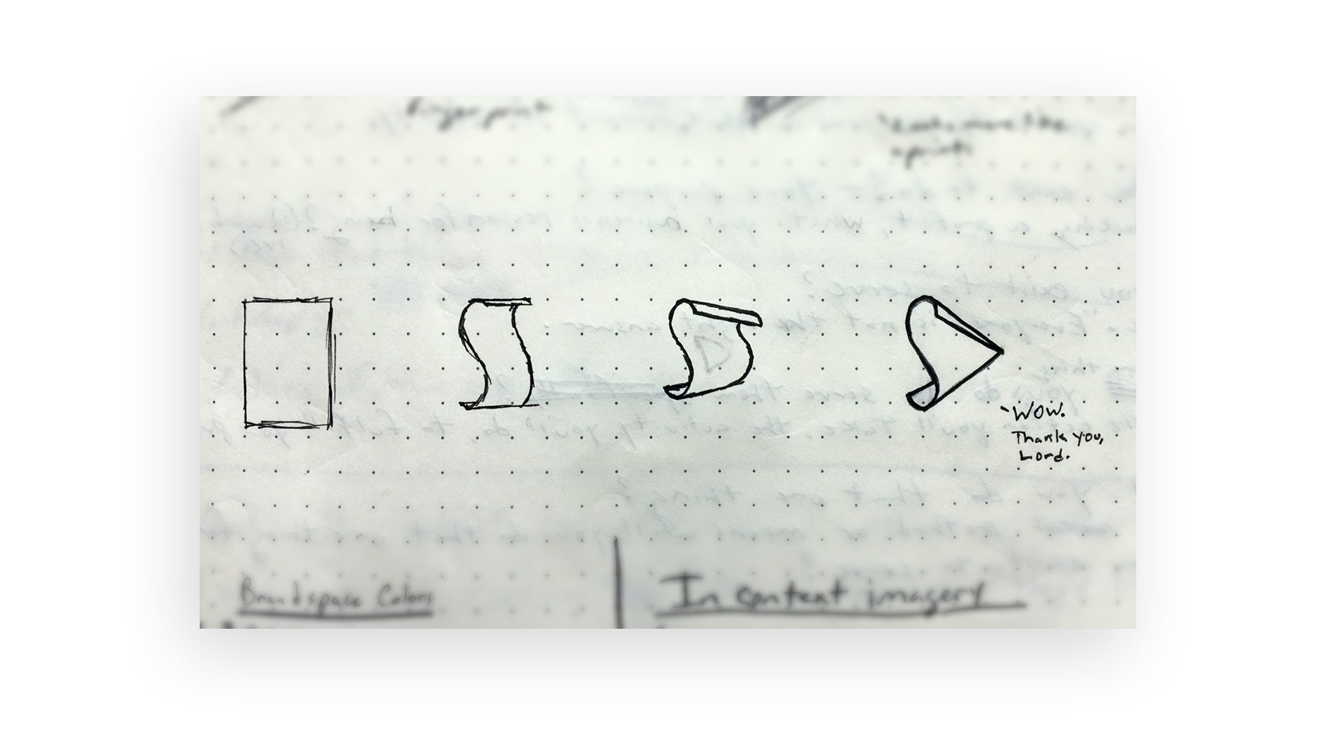
Agreeing on the objective of our task, I explored many (many) concepts via pencil sketches. When I finally landed on one that resonated with the cause of the company and what it produces, yeah, I was pretty excited.
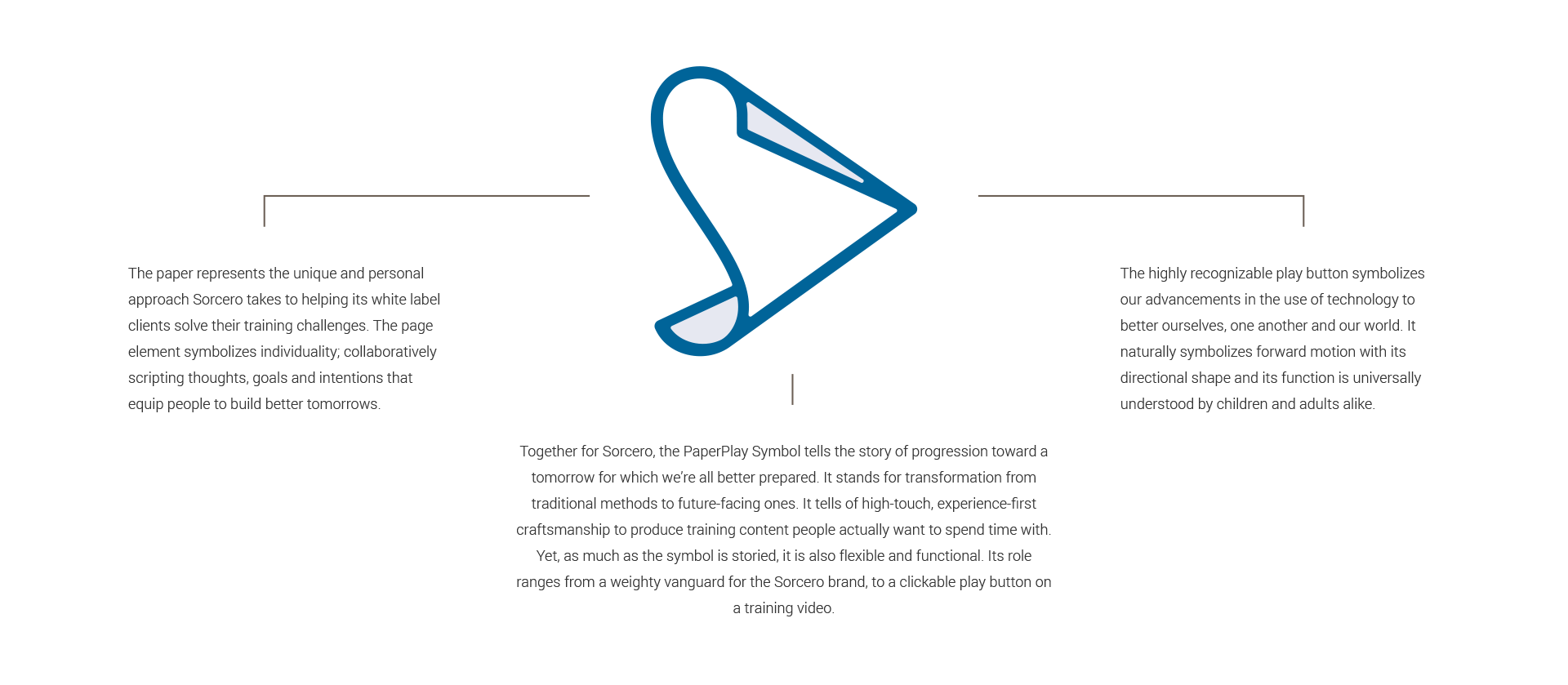
Thinking of artifacts common to a Hollywood sorcerer, the symbol began with a concept of a scroll transforming it into something more modern. The concept was iterated upon and distilled to a simpler and more flexible form, visually fusing a sheet of paper with a play button – a symbol relevant to the company.

As the concept was refined, it presented a path to break away from common conventions in the edtech brand space. The "PaperPlay" symbol became a clean and confident mark that felt and familiar and even functional.

‘PaperPlay’ Symbol Logic
(CLICK TO VIEW LARGER)
The Wordmark
While the symbol iteratively took shape, we began working on the wordmark. The aim was to complement the feel of the PaperPlay symbol with a logotype that could stand just as confidently on its own.
Though based on the classic-inspired typeface, Paganini, the Sorcero wordmark is almost entirely customized. The serifed characters help visually distinguish the name from others in the brand space. It creates the perception that Sorcero is something more than another edtech outfit. It is a company that refuses to merely throw a platform at a problem as so many others resort to doing.
The primary color of the Sorcero brand identity is familiar to the tech space, but takes its cue from the blue of a ballpoint pen. Looking to that inspiration continues an effort to capture a sense of identity and personalization as Sorcero’s solutions are largely unique to its client’s needs.
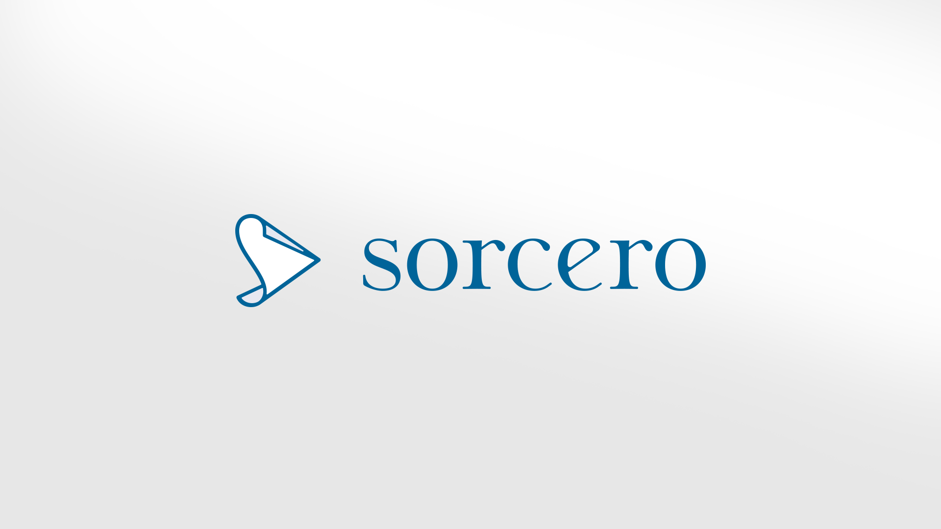
Together, the symbol and wordmark lock up to create a meaningfully differentiated, deeply appropriate core brand identity.
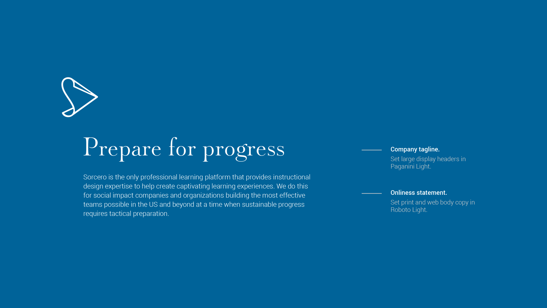
Typography and Core Message
We studied the market to help Sorcero choose a strategic brand position, then worked with the founder team to develop the core messaging that would set the tone for marketing.
Rounding out the core brand identity design effort, we decided on a pairing of Paganini and Roboto Light to express the brand in written form. The pair presented a benefit of elegance and accessibility that seemed right for the company.

Summary
Driven to become the edtech firm social impact companies and organizations trust to create authentic and enjoyable learning experiences, this startup's founder team approached my brand design consultancy, Thinkory. Our tasks were to lay the foundation of the brand, rename the company, and redesign its core brand identity.
In the end, Sorcero's brand identity pointed to the company's ability to transform an organization's unique training practices into highly engaging, online learning experiences. The new brand identity breaks away from common conventions in the edtech brand space to create a clean and confident mark of premium experiences. A mark that feels modern, optimistic, and familiar.