Dr Lisa Galper is a licensed clinical psychologist, author, public speaker, and workshop facilitator in Scottsdale, Arizona. Her passion is collaborating with clients to improve their lives with new perspectives while helping them remove unwanted barriers so they can confidently make desired life changes.
For years Lisa's work has transformed the behaviors of people struggling with unhealthy, emotionally charged eating habits under the moniker "Power Over Food."
The Problem
Lisa aimed to build on the success of her practice and broaden its scope. She wanted to reach more people who feel overwhelmed by life’s challenges regardless of the specific unhealthy behaviors they develop.
The Thinking
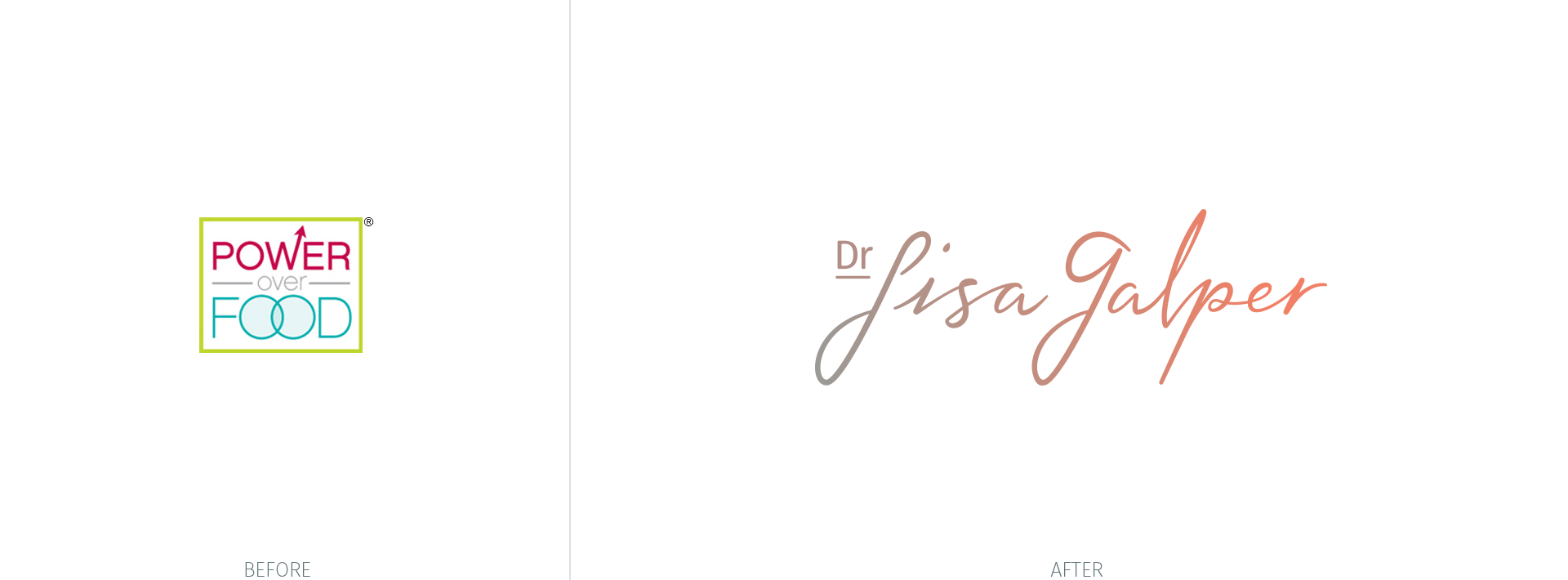
After some conversation, we agreed that working toward this aim should mean developing a new core brand identity for the practice using Lisa’s name, "Dr Lisa Galper," shifting away from a focus on food specifically.
For the new core identity to succeed for Lisa's aim, it needed to meet three fundamental requirements:
Be meaningful – Full of substance relevant to Lisa's work and experiences with Lisa.
Be presentable – Aesthetically pleasing and sensibly structured.
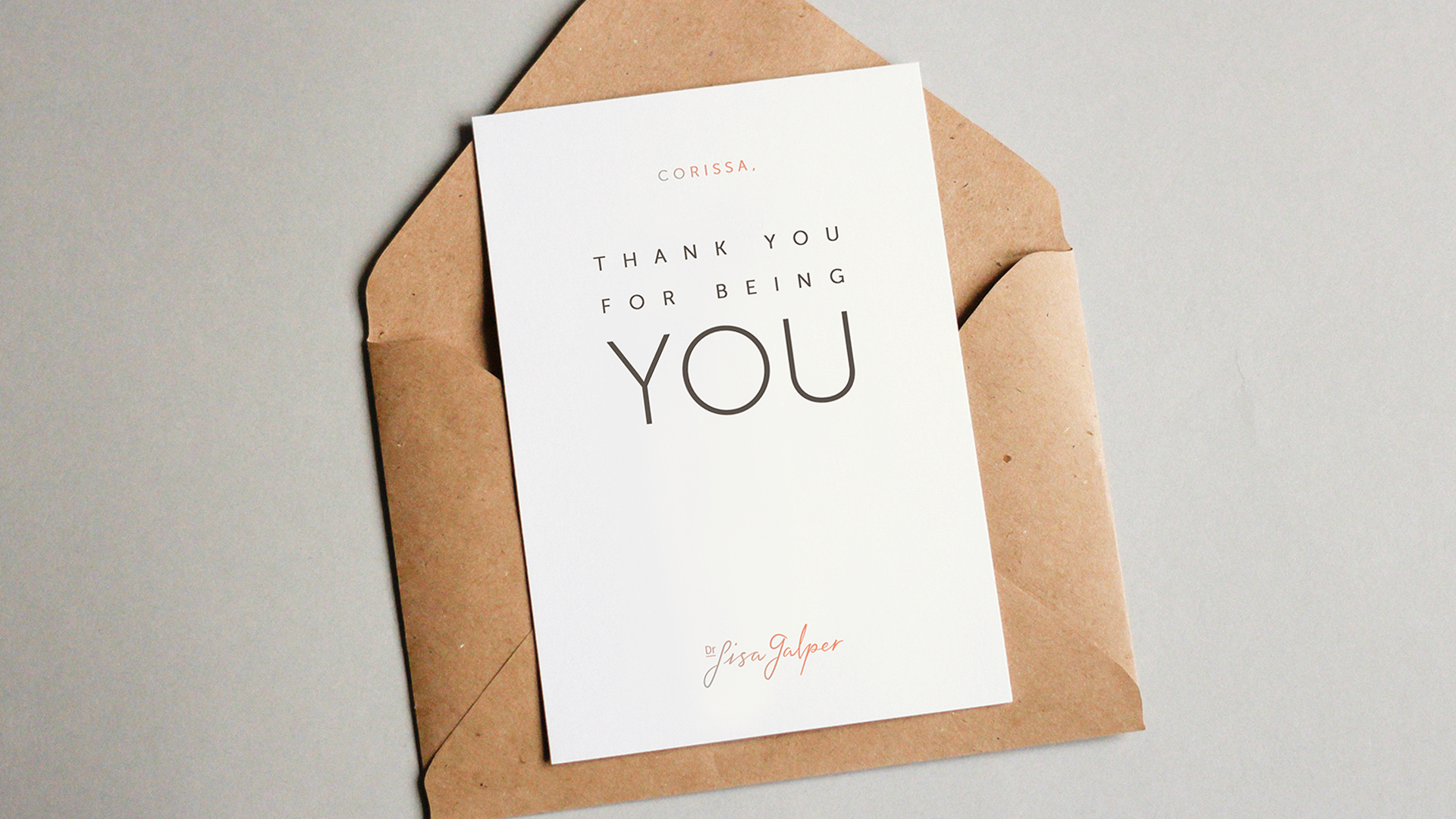
Be functional – Suited for a wide range of uses online and in print.
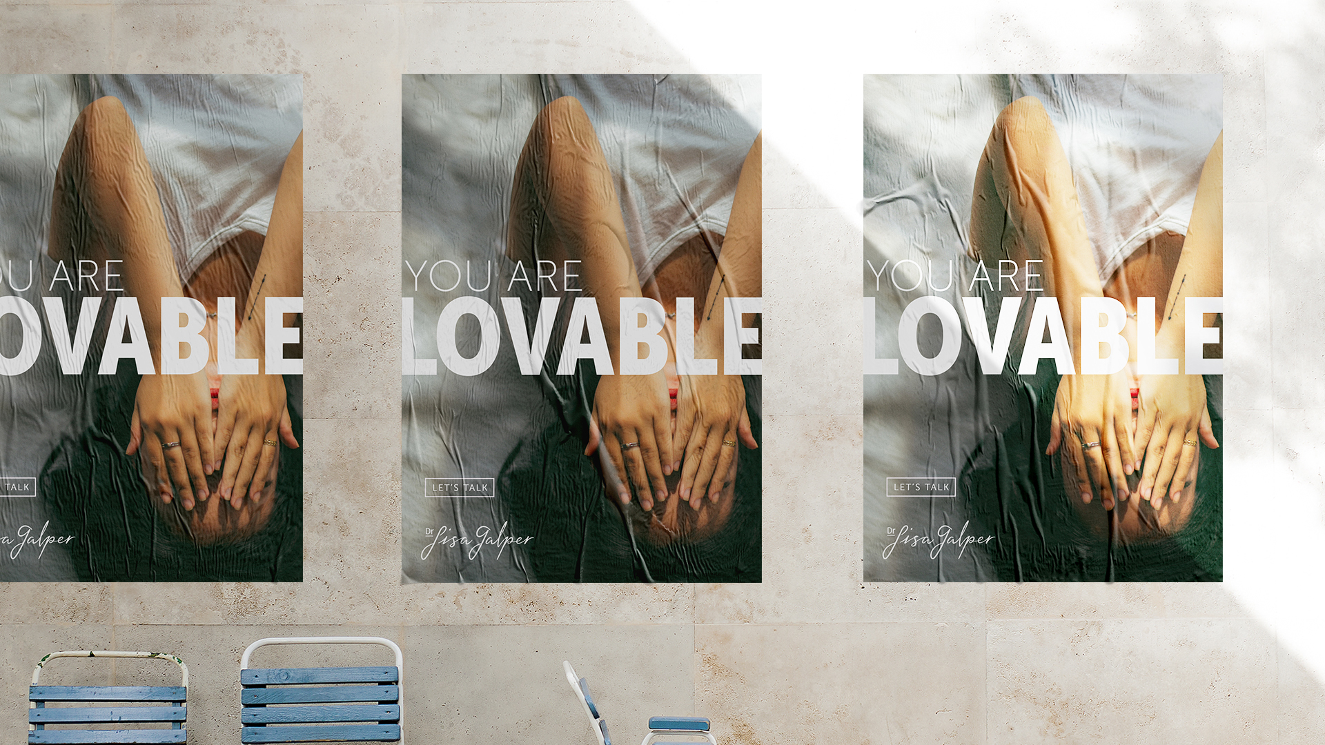
Authentic Vibes Only.
Considering the broadened aim of Lisa’s practice, and a brand space full of poorly crafted brand identities for similar practices in the Scottsdale market, the objective of the design became clear. We set out to design a wordmark that authentically projects the personality and unique vibe of Dr Lisa Galper. An enduring mark that fuels recognition and helps Lisa win the trust of new clients in the area.
Lisa and I wrote those objectives and other requirements into a creative brief. With that in hand, I decided our efforts would be helped by a mood board.

Mood Board
To visualize the creative brief and capture the mood and feeling the brand should evoke, the mood board was assembled to portray three primary traits:
PEACEFUL - A kind and wise guide for the journey.
WARM - Help that is empathetic and non-judgmental.
CONFIDENT - Real change through grace and candor.
We wanted to craft an identity that felt consistent with Lisa's message: "You are lovable, acceptable, and capable of living a fulfilling life."
To learn more about the process of creating this mood board, visit this project page on Skillshare.com.
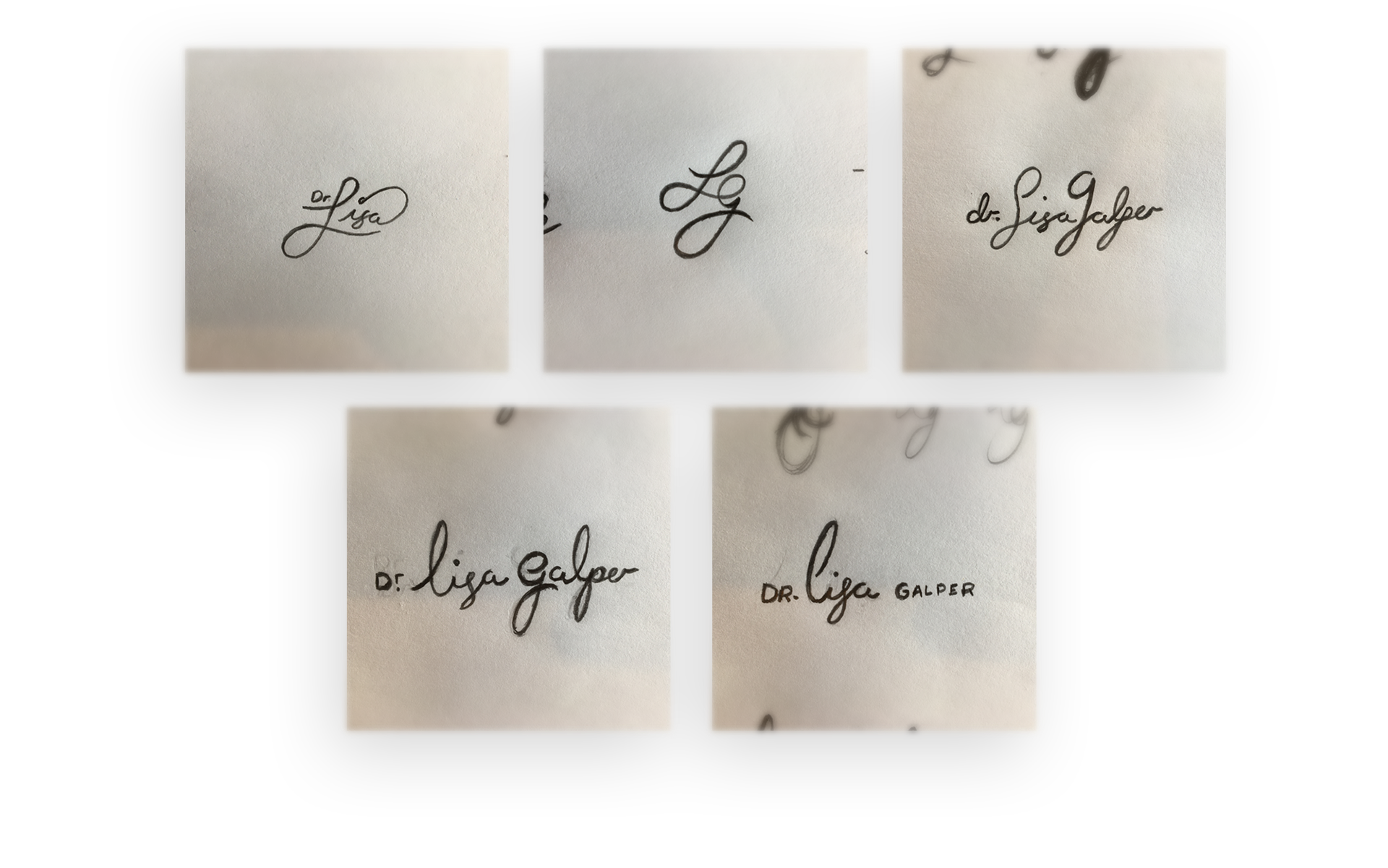
Sketching Signatures
From the start of the project and after Lisa and I established objectives in the creative brief, I envisioned a signature concept. As a wordmark goes, a signature is an authentic and natural expression of ourselves, our personalities, and even how we want to be perceived. It's sort of a natural logo, if you will.
I sketched many concepts, studied Lisa's own signature, and explored ways of creating an authentic wordmark that met the objectives of our project. Most of my rough pencil sketches were ... horrible. But the point in this phase is to get through the ideas to find the ones that work best for all we're trying to achieve.
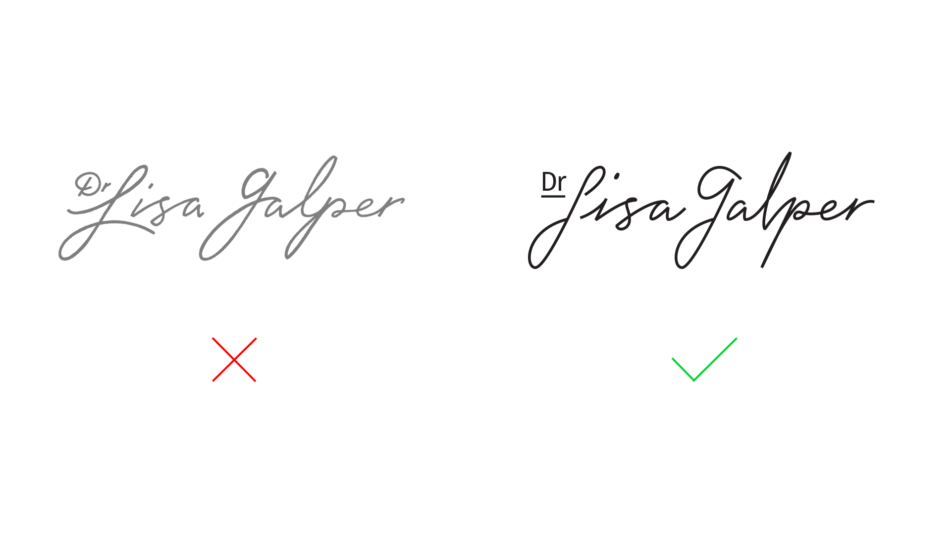
Right, but not quite.
Wanting to capture a mood of peace and warmth with the signature, I rendered a concept that flowed freely from one end to the other (the concept on the left). Its line was nearly continuous and it had a potential elegance to it for a rough sketch.
And that was the problem.
Lisa and I found that, while it had potential, it was too elegant – too soft. We talked and gave greater context to one of the primary traits her brand identity was to convey, confidence. Lisa explained that experiences with her aren't entirely gentle. While peaceful and warm were certainly accurate traits to convey, Lisa clarified that there should be a kind of inelegant twist to the third trait, confidence.
That insight was golden – and admittedly missed in the mood board phase. But we got clarity through the sketch phase of the process and I had a better sense of what the signature wordmark should convey.
The flow of the concept was entirely reworked (the one on the right above). It allowed "interruptions" to the flow and introduced strategic imperfections to humanize the wordmark. To add a sense of dynamism, many of the soft loops were replaced with tighter, sharper transitions – as in the "i" in "Lisa" and the "lp" in "Galper." To increase a sense of confidence, the overall slant of the characters was reduced making the wordmark more upright and less gentle. Lastly, the "Dr" was simplified and visually set apart. Lisa doesn't get caught up in titles (to my delight, she never asked that I address her as "doctor" anything), but I felt it appropriate to call out and underscore this designation. While peaceful and warm, Lisa is a doctor – trained, experienced, and good at what she does.
The rendering was still rough, but Lisa and I agreed we were now heading in the right direction again. Yay!

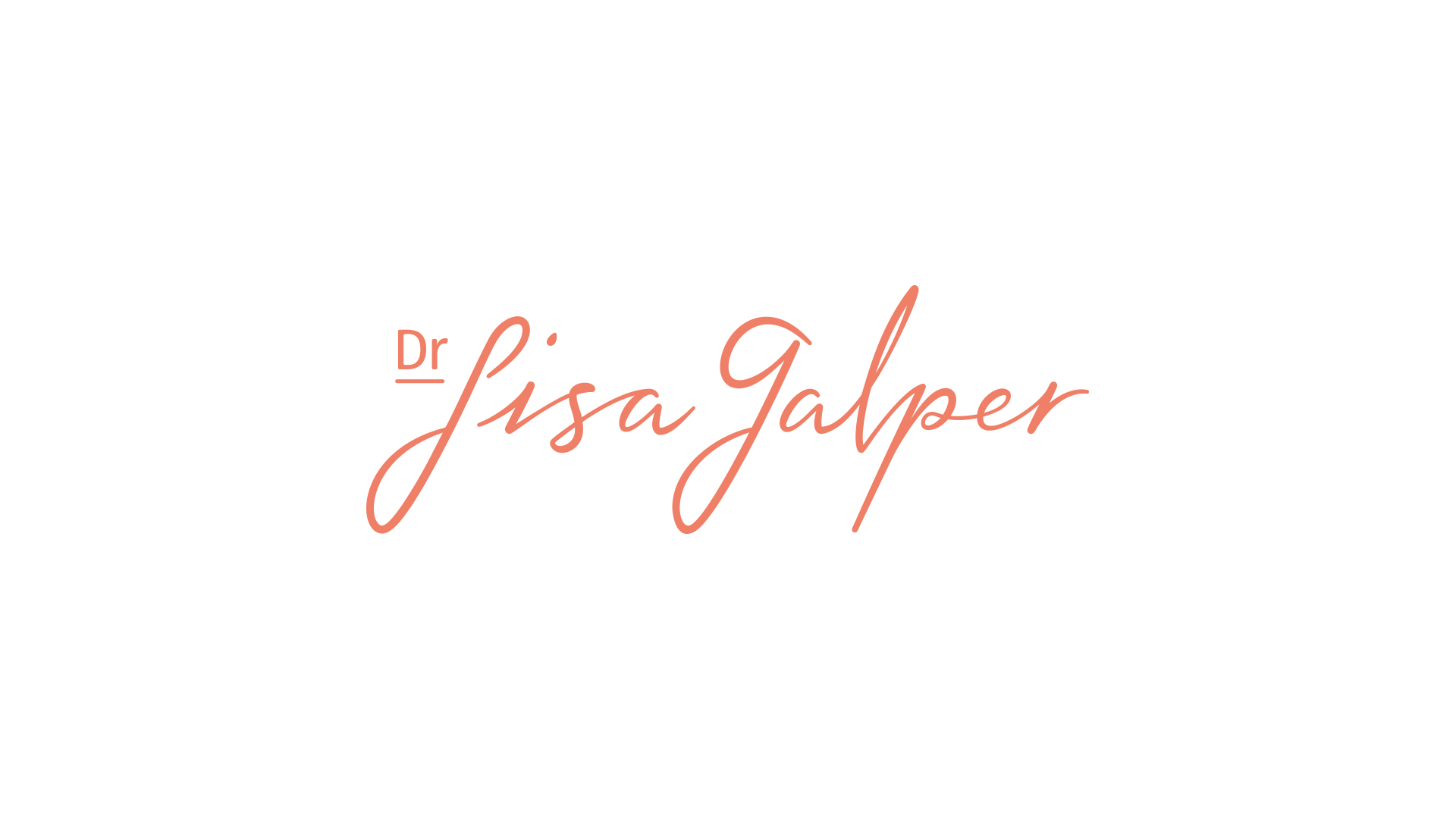
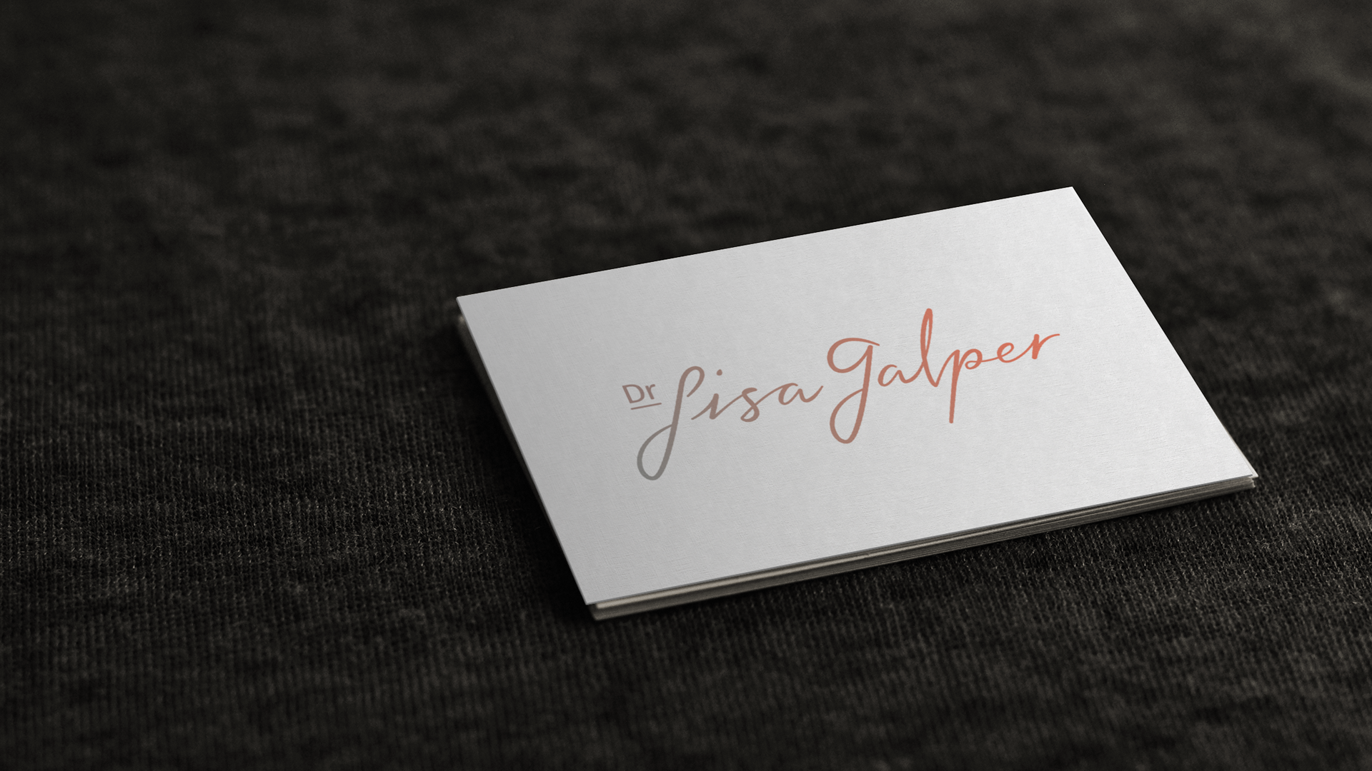
The Wordmark
Further digital refinements of the signature wordmark allowed it to flow more naturally – albeit not uniformly – from end to end. Through handcrafted line weight variances, and letters that disregard a typographic baseline, we designed a wordmark that embraces imperfections – advocating for their beauty. Lisa now had a mark that confidently said, "this is who I am."
But could it say more? I do love a good color story, afterall.
(CLICK TO VIEW LARGER)
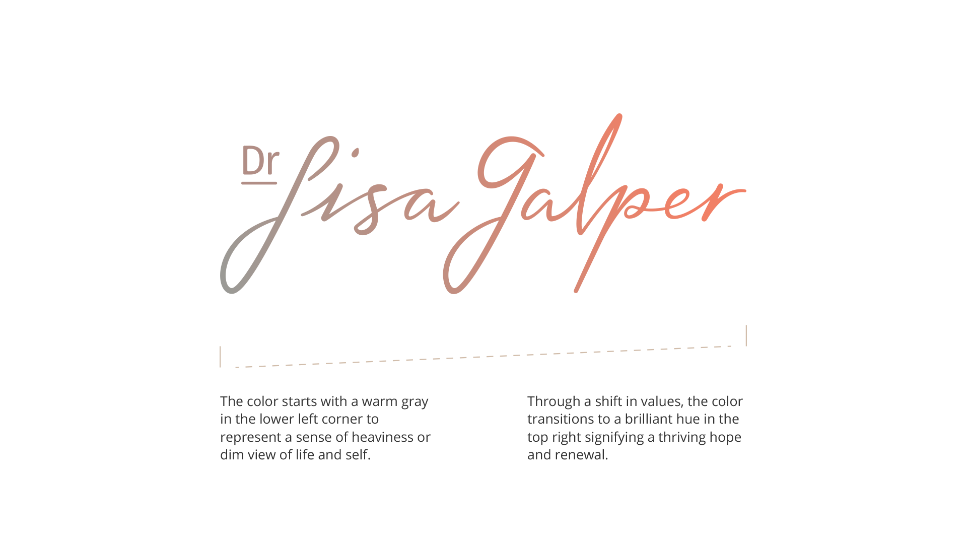
Color Story
As a psychologist empowering people to create their best lives, Lisa moves many from a place of darkness to a place of light and life. So I have the signature wordmark a coloration that summarizes that story symbolically.
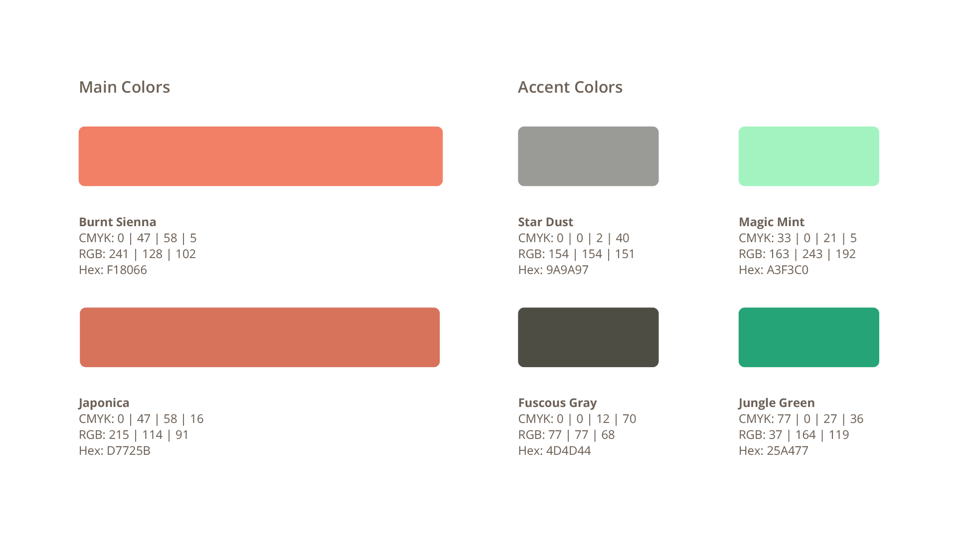
Color Palette
A small palette of hues was cultivated to help unify Lisa's future brand expressions. These main and accent colors take inspiration from the wordmark’s color story and create a complementary scheme for use in any medium.

The sum of more than these parts.
The design process for Dr Lisa Galper was about as introspective as a logo design project may get. We weren't just representing an entity or a practice, but a person. The wordmark had some personifying to do and that meant more questions, perspectives, and insights. Far more than captured on this project page. For example, we surveyed several of Lisa's past clients to get their impression of her methods and delivery.
In the end, a degree of reflective truth was captured in a mark that's as meaningful as it is presentable and functional. Together, Lisia and I crafted what she needs to carry her practice into its next exciting phase of helping people live full and freeing lives.