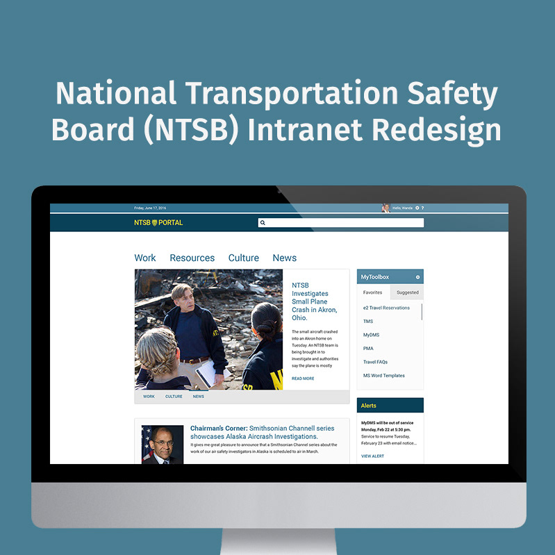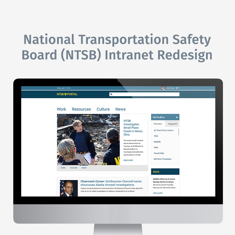
The National Transportation Safety Board (NTSB) is an independent US Federal agency charged with determining the probable cause of transportation accidents, promoting transportation safety and assisting victims of transportation accidents and their families.
Problem
I was charged with the rather monumental task of reshaping the user experience and redesigning the user interface for the government agency’s intranet portal (read the full project story here).
To kick-off the project, a few key hurdles had to be overcome:
1. Provide a high-level outline of the project that the CIO, adjacent department Chiefs, and Chairman can understand and support
2. Provide that outline in such a way that it can be referenced without a speaker
3. Reset client expectations for the team’s design approach and visual aesthetic
1. Provide a high-level outline of the project that the CIO, adjacent department Chiefs, and Chairman can understand and support
2. Provide that outline in such a way that it can be referenced without a speaker
3. Reset client expectations for the team’s design approach and visual aesthetic
Thinking
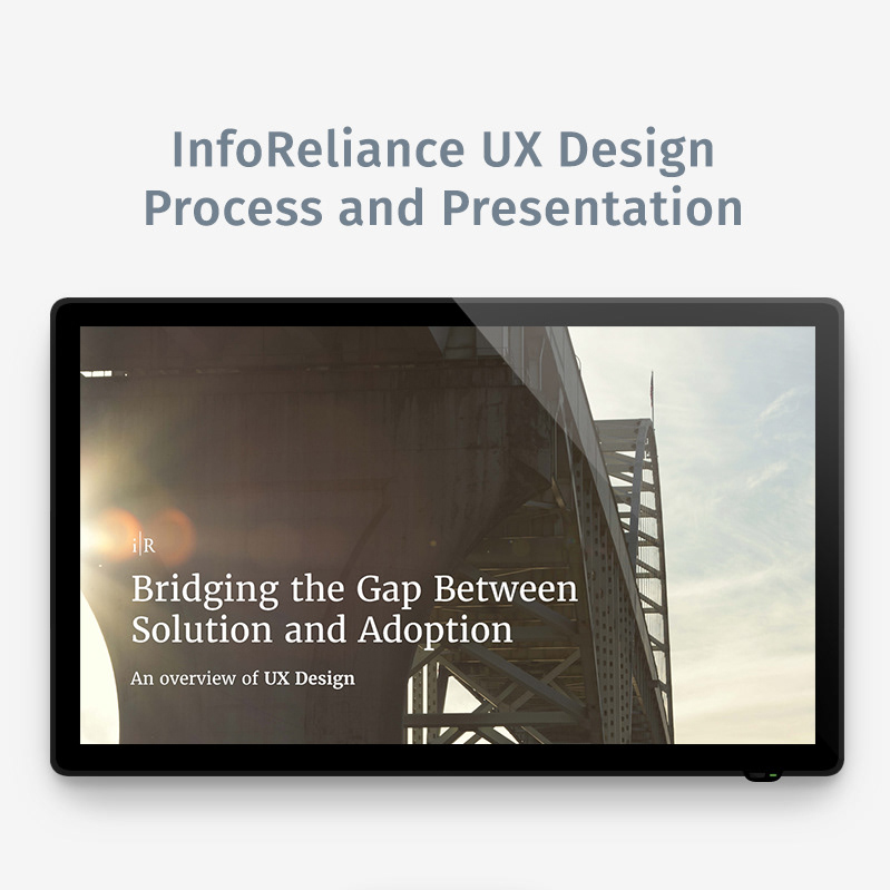
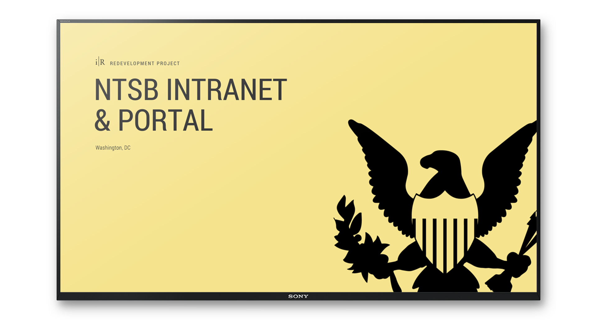
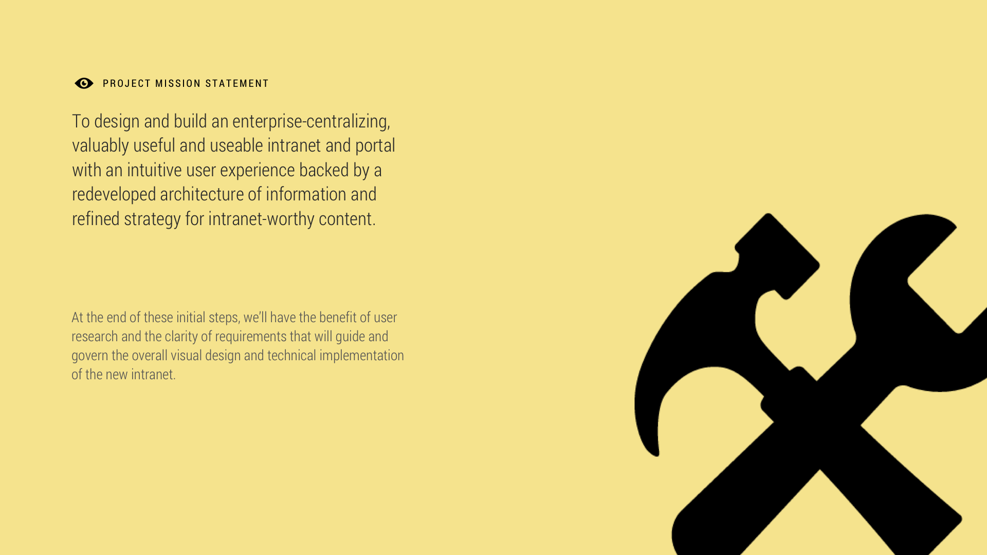
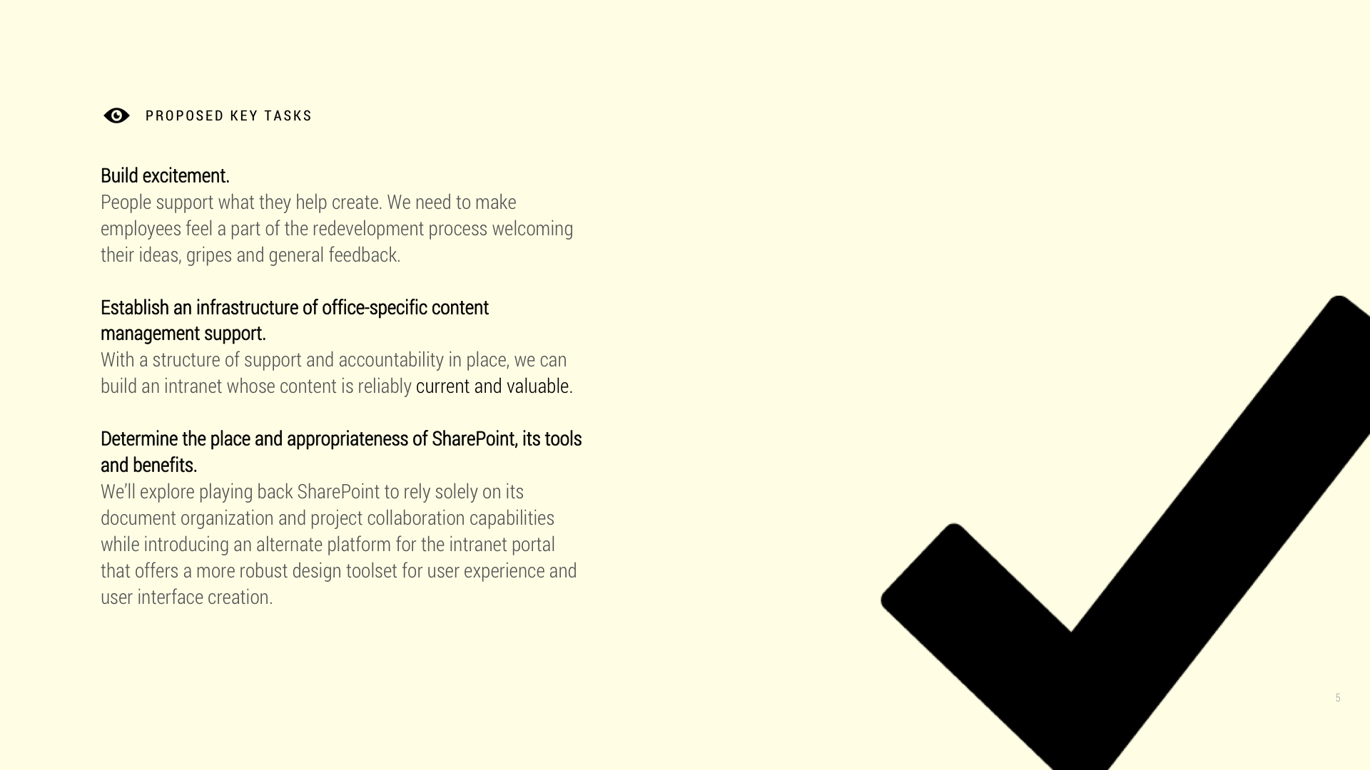
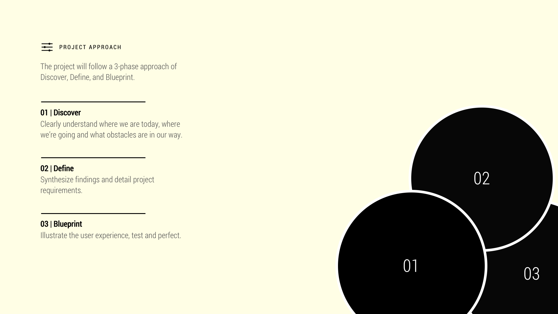
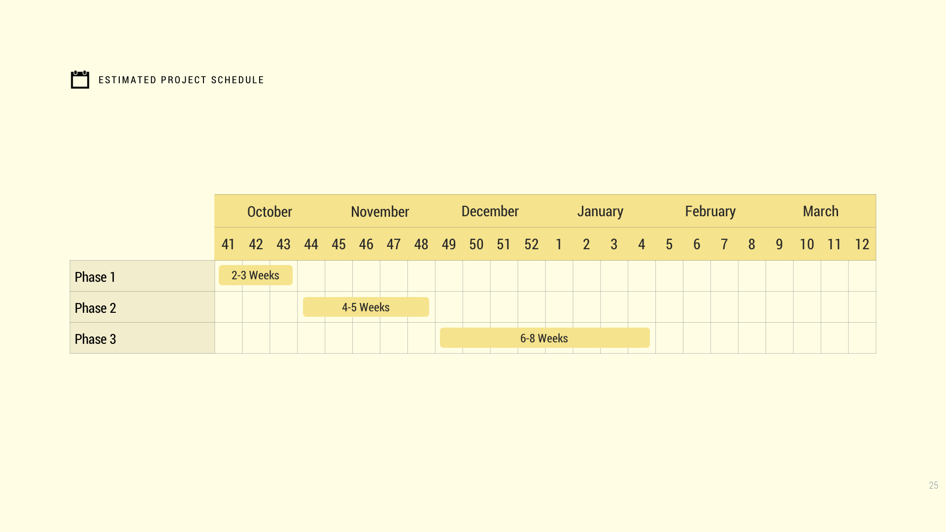
Create a visually lean, but thoughtfully sophisticated slide deck that paves the way for a minimal design approach. The deck should also be versatile, working equally well to aid a live presentation and be easily understood if distributed via email.
Old Presentation Deck
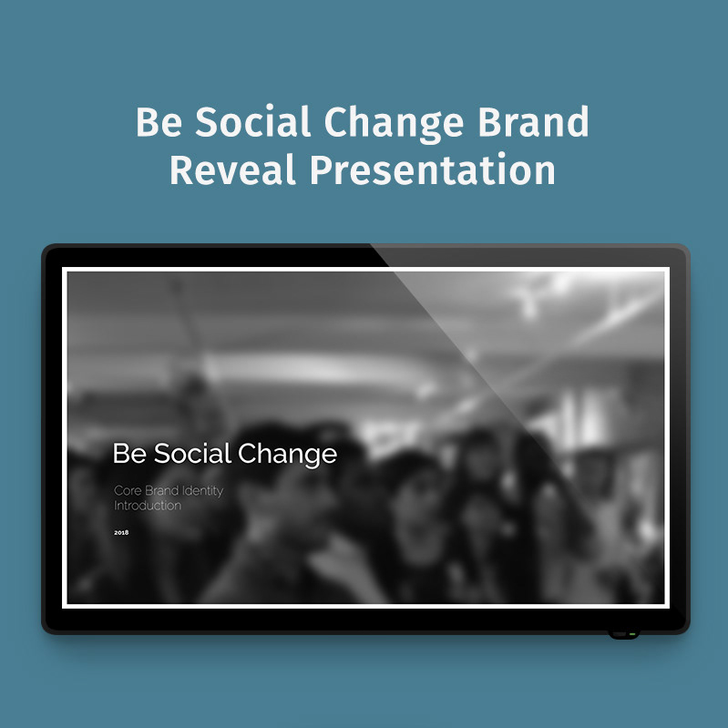
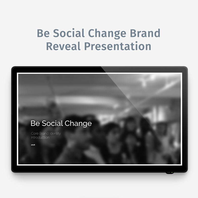
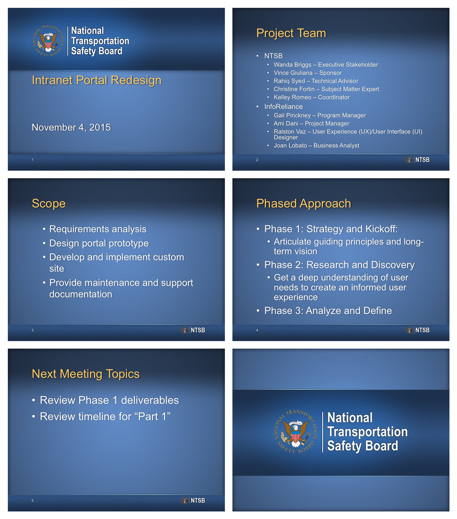
While visually aligned with the design aesthetic of the NTSB, the original slide deck created to introduce the project set too low a bar for design. It was created just before I took over the project and was the first design problem I addressed.
The New Presentation’s Ulterior Motive
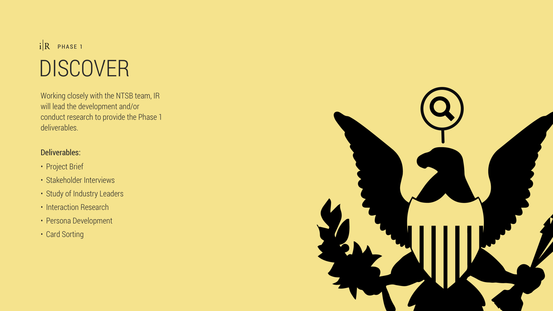
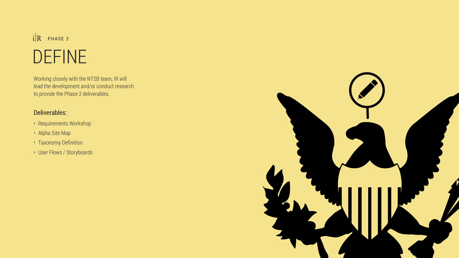
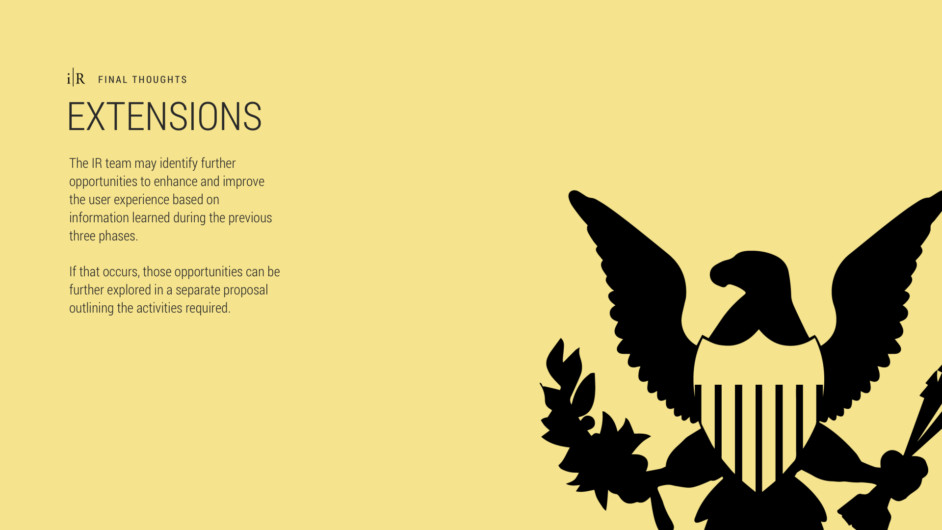
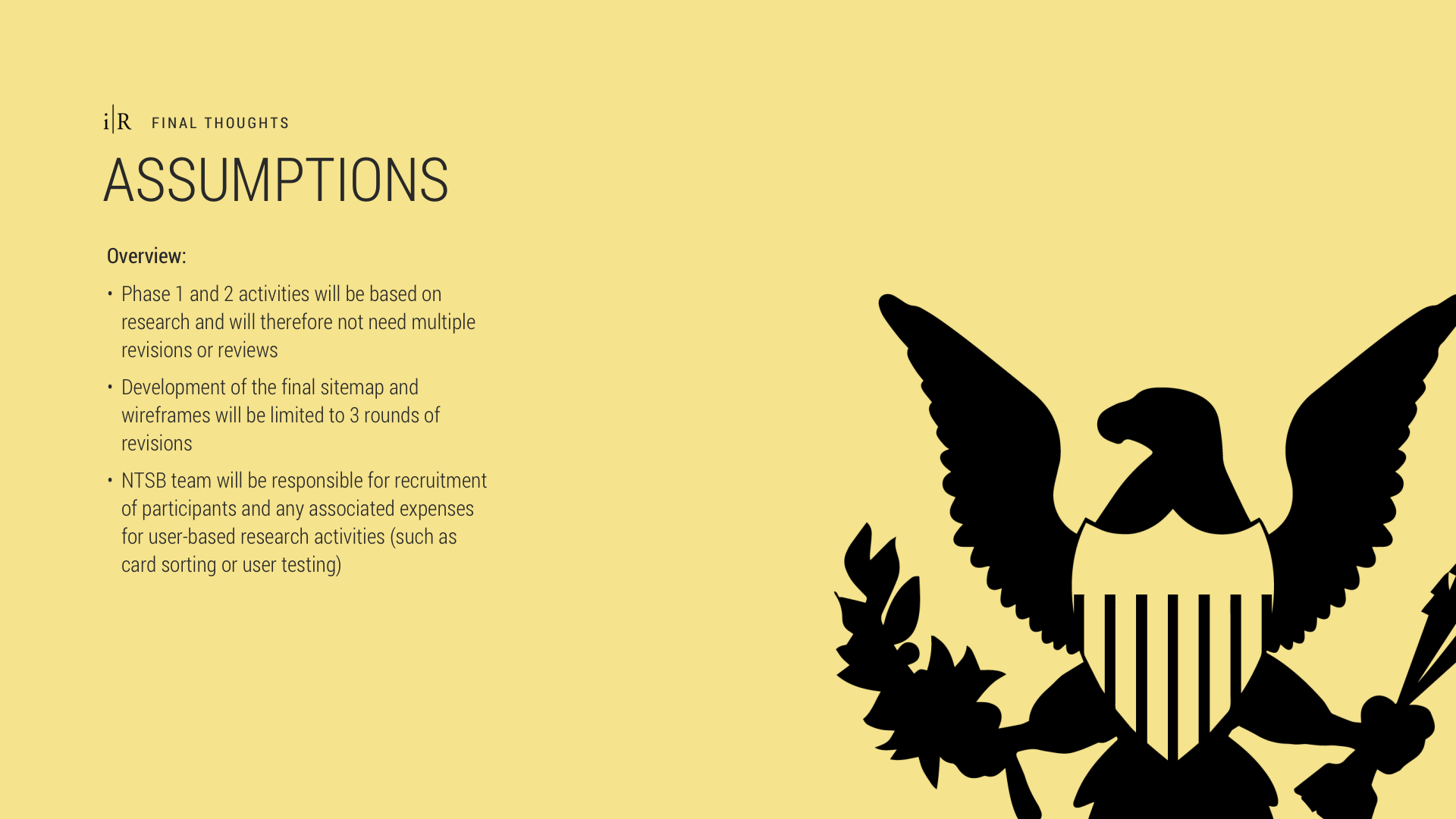
I wanted to test the capacity of the Chief Information Officer and other key stakeholders in leadership at the agency to appreciate the fundamental principles of good design. I began by stripping the agency’s iconic eagle of all depth and color, leaving only a silhouette that everyone in the boardroom would recognize. I then created adopted and extended a simple set of icons, each positioned at the top left and lower right of most slides.
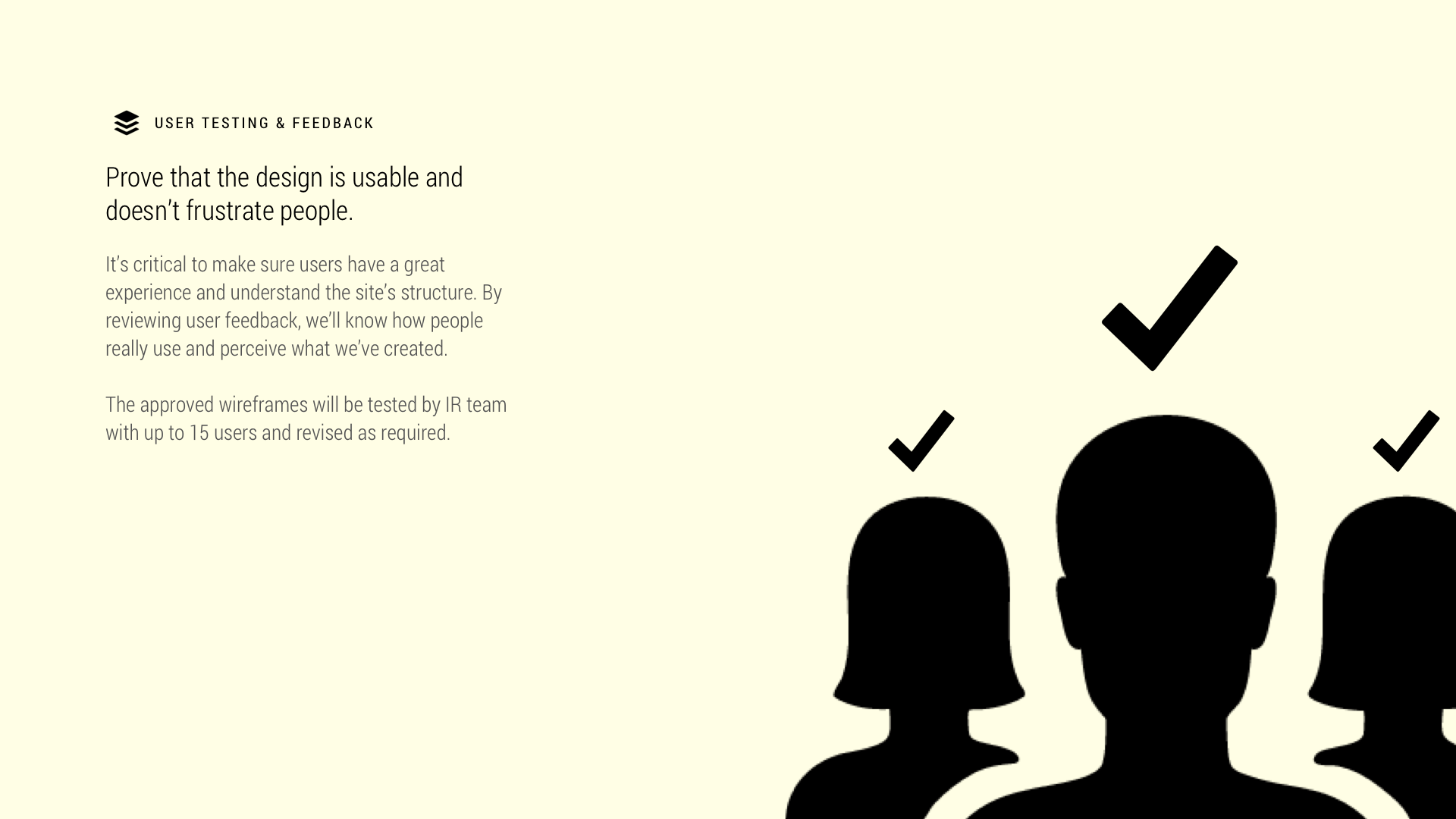
The NTSB’s intranet suffered poor information architecture and a mixture of sorely outdated UI elements. Assessing the client’s ability and willingness to accept a ‘minimize to emphasize’ design approach important to achieve with the kick-off presentation before embarking on far more complex design challenges in the project.


Good for Solo Review Too
I’m a big fan of low content, high focus when it comes to designing presentations. Sometimes, however, you must account for the inability to get all leadership stakeholders in the same room at the same time. With specialists and division chiefs leading all the way up to the Chairman, I knew the presentation needed to offer an outline that could be reviewed and understood without the aid of a speaker (me).
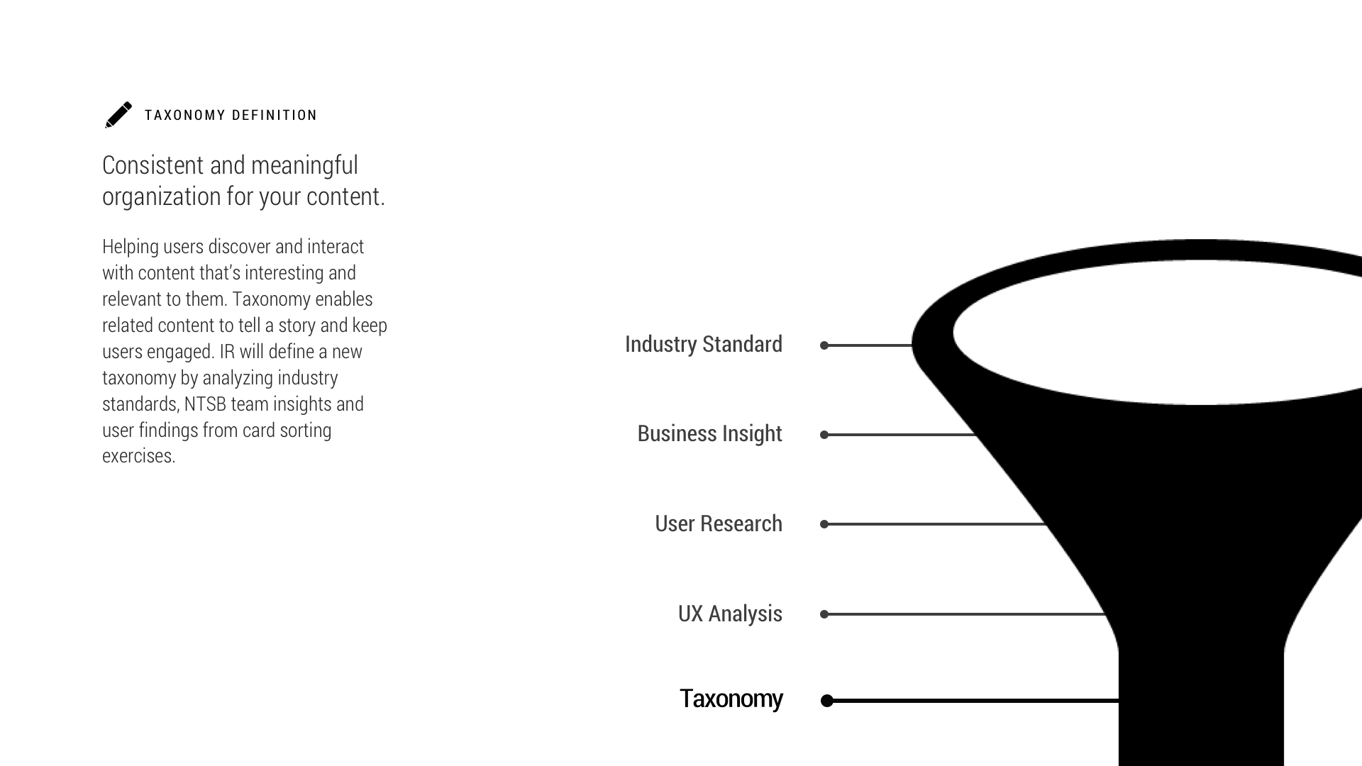
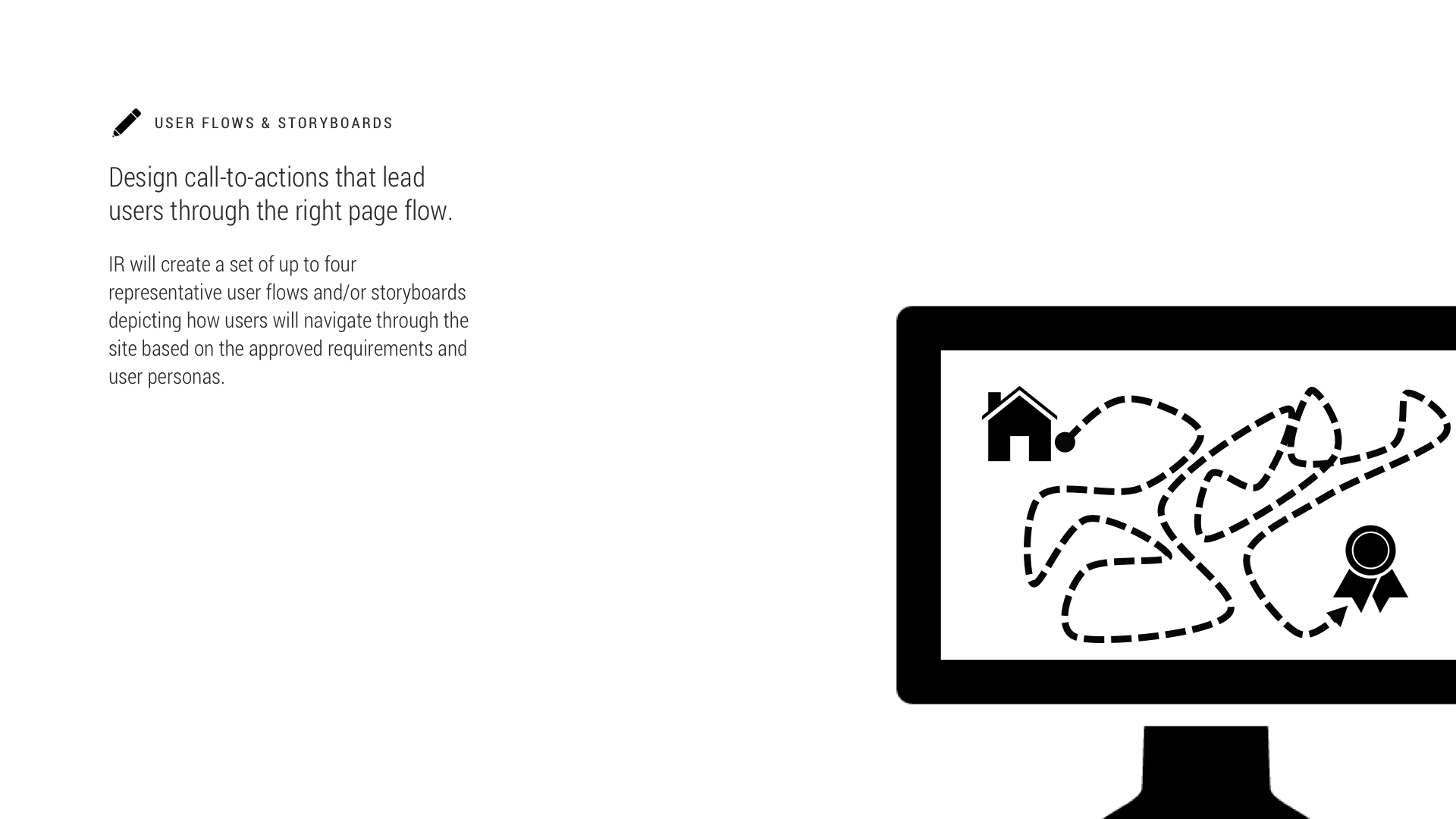
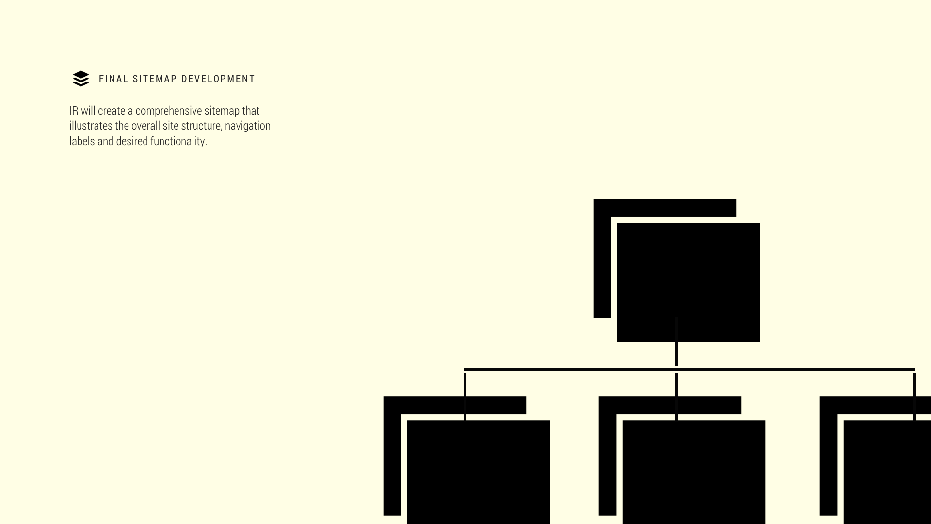
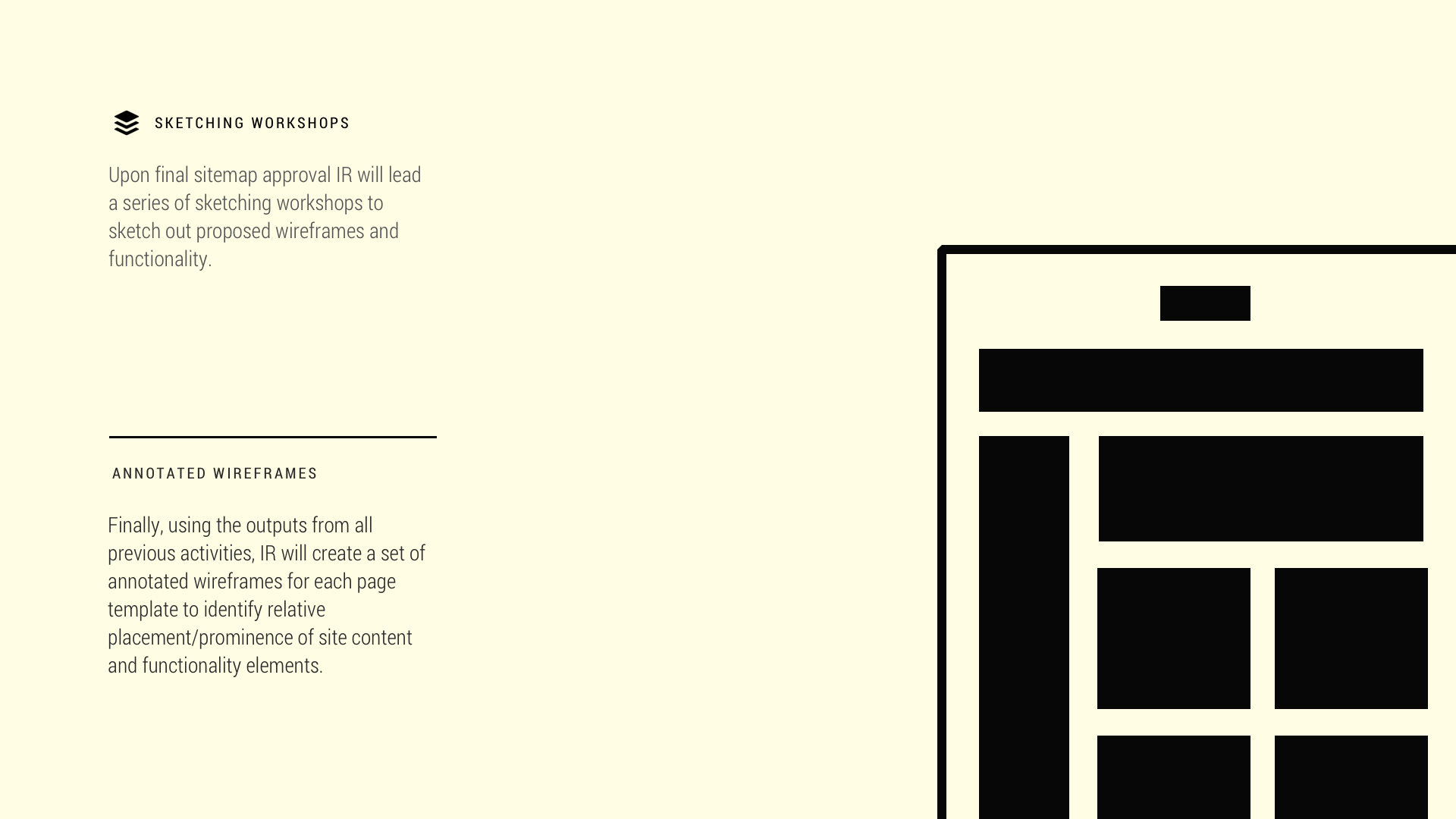
Each slide provides a brief summation or definition that acclimated solo reviewers throughout the agency to a design process that, while foreign to them, was key to the success of the project. The presentation also reset stakeholders’ perception of an assumed, simple reskinning of an ignored organization resource – the portal. It introduced the depth of research, synthesis, and insight that must and will undergird every design decision made throughout the project.

Result
The kick-off became a bit of a hit, generating excitement throughout the agency. I was asked to run the presentation twice – the second time presenting to counterparts to the CIO, my immediate client. Most notably, the slide deck garnered respect for the portal redesign project which had previously stalled at the agency and was thought to be soon canceled. After giving the presentation and circulating it internally, new interest arose from various divisions with leaders wanting to know how they could contribute to the effort. I call that a win.
Project Stats
Length of project:
About 2 weeks
About 2 weeks
Skills used:
Research, Copywriting, Icon Design, Information Architecture
Research, Copywriting, Icon Design, Information Architecture
Tools used:
Illustrator, Powerpoint, Typekit
Illustrator, Powerpoint, Typekit