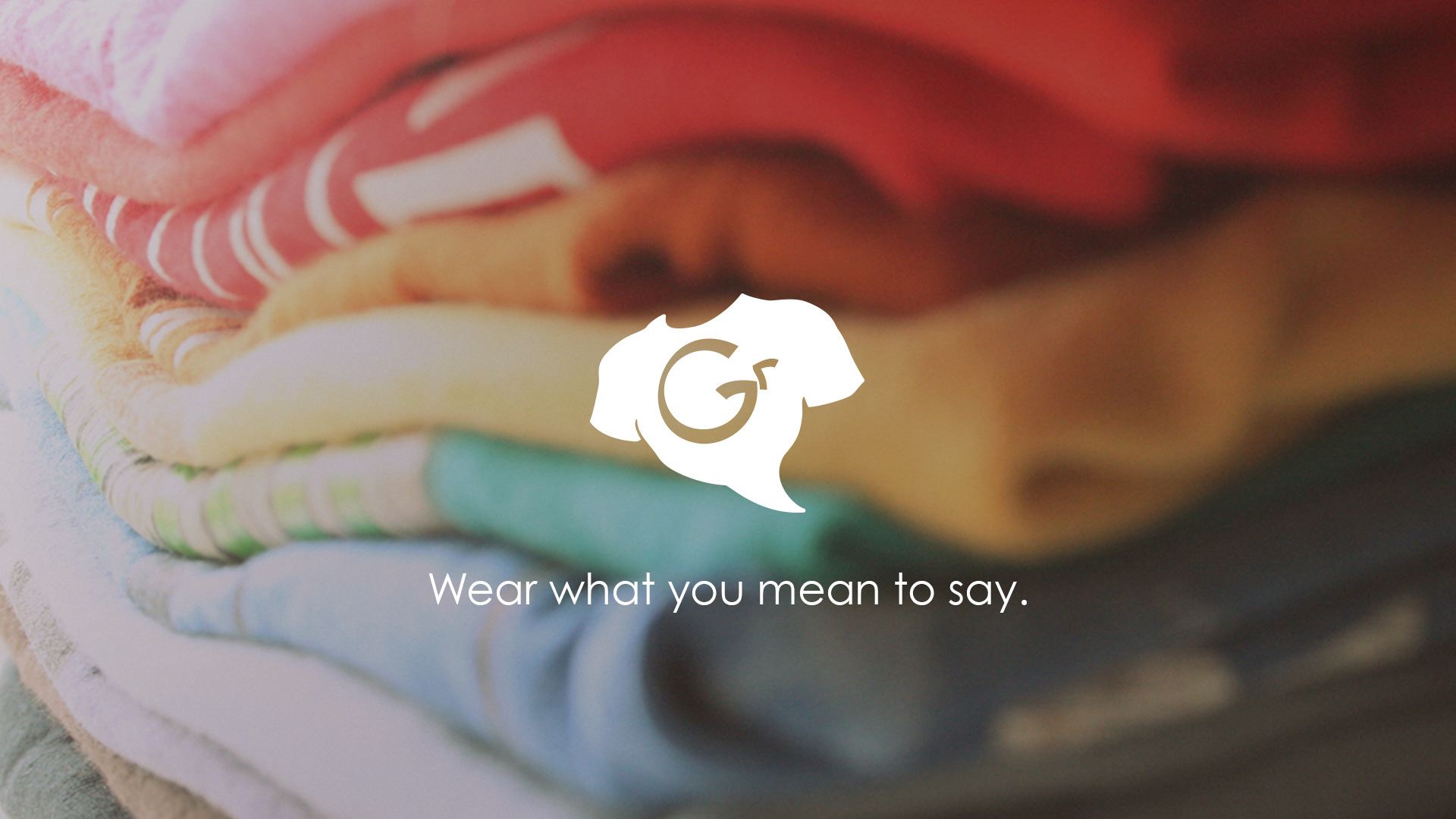
If you can’t find the words, find the shirt. That's the idea behind Gabbyrags, a t-shirt whose motto is "Wear what you mean to say."
The Problem
The idea behind the company was full and exciting, but as a brand, it was formless. Once we worked out the core purpose and name, the visual identity had to be tackled.
The Thinking
Craft a brand identity in such a way that it visually celebrates self expression while feeling sort of heroic!
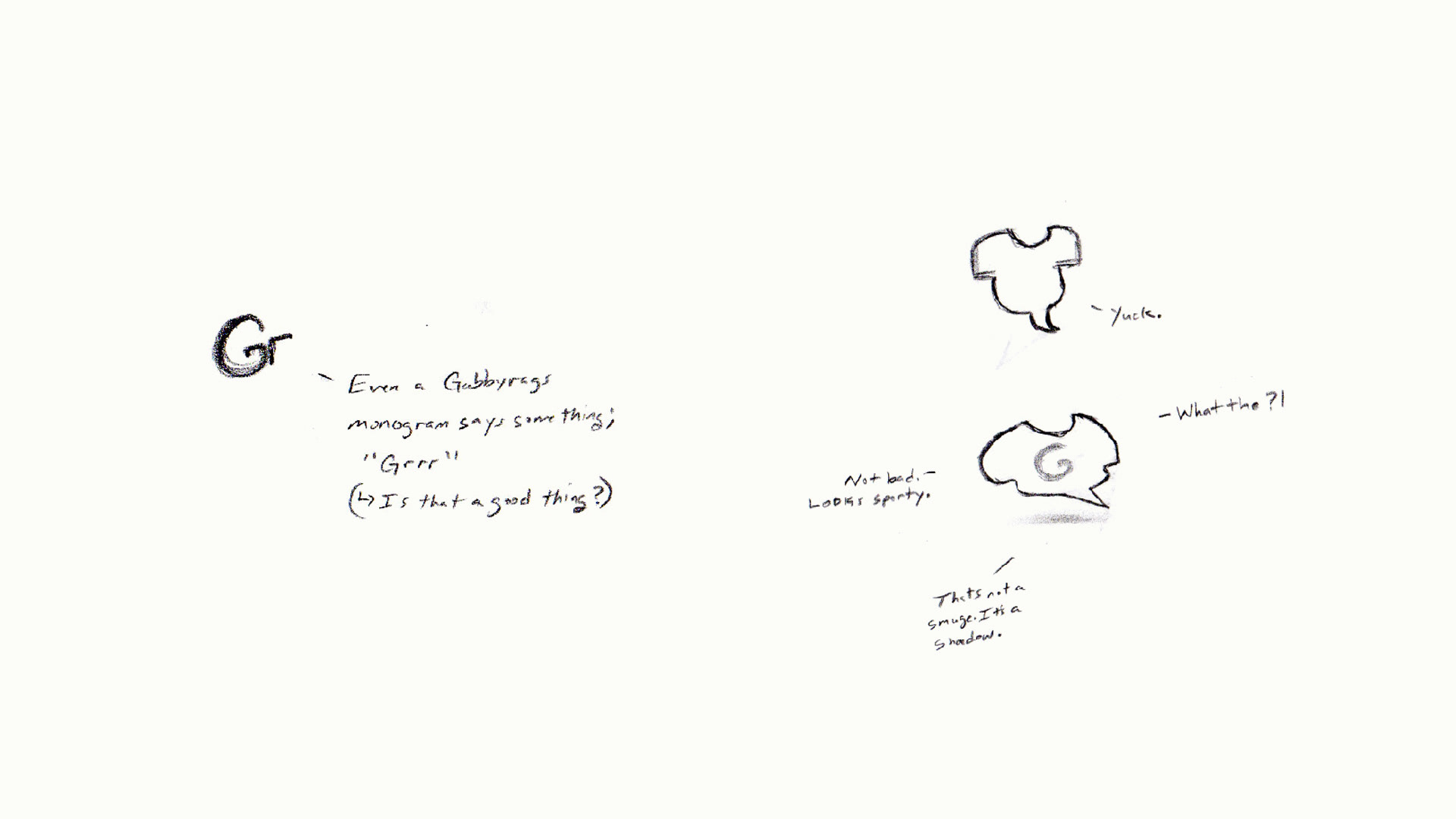

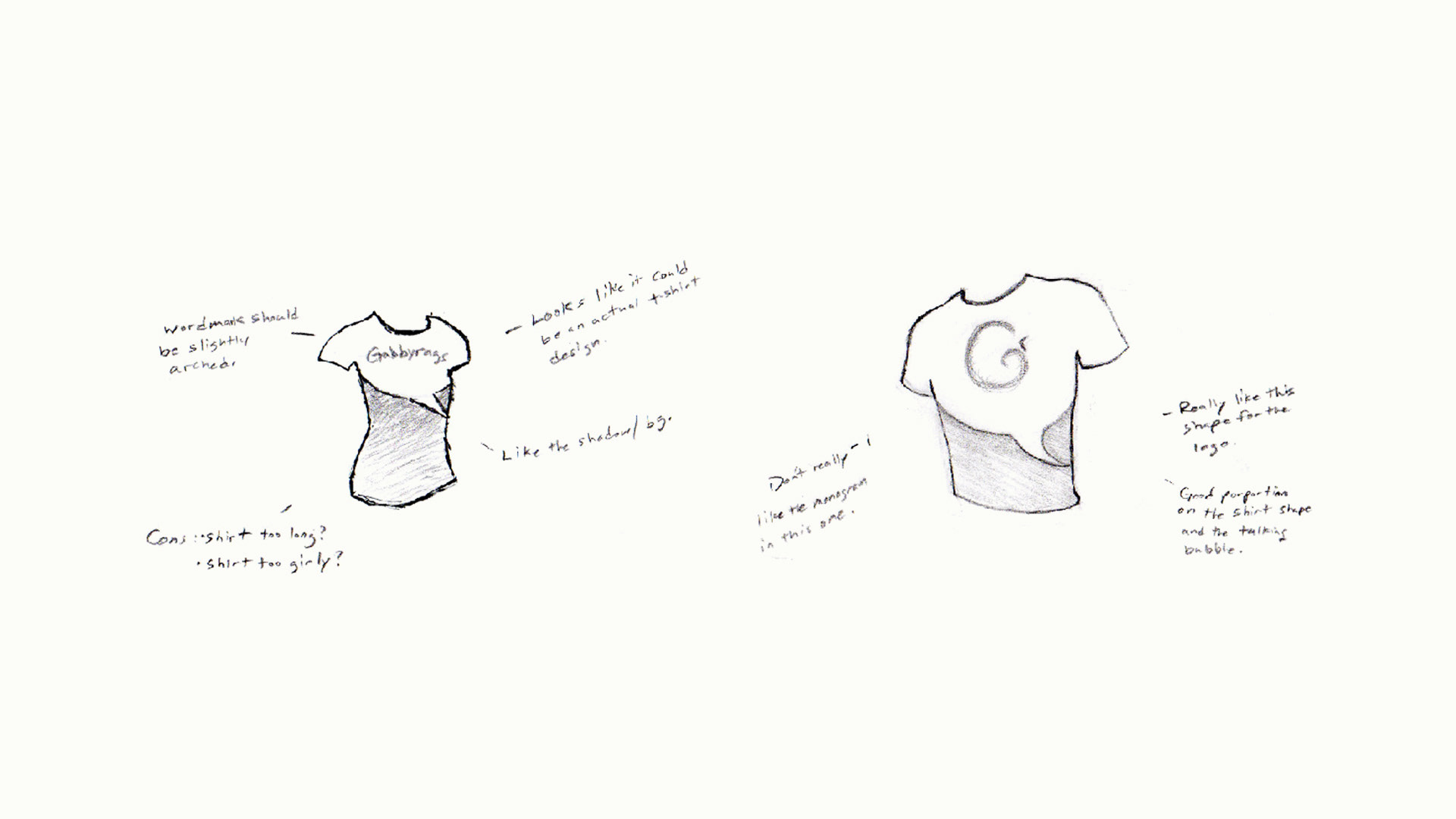
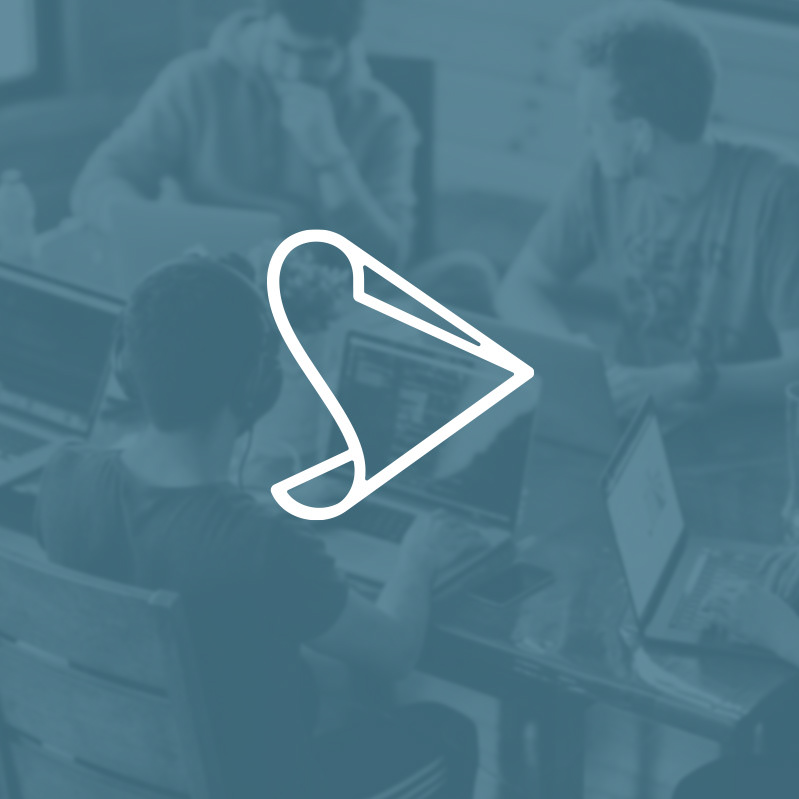
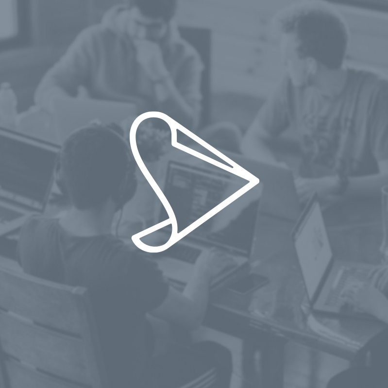
My sketches for the Gabbyrags brandmark quickly centered on a monogram, a t-shirt and some incorporation of a speech bubble. Initial ideas were, well, ugly. But persistence and creative curiosity began to make a good idea take shape.
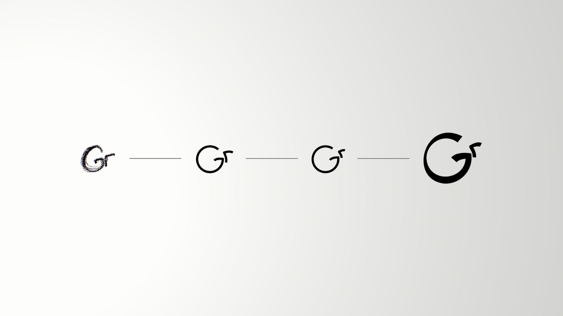
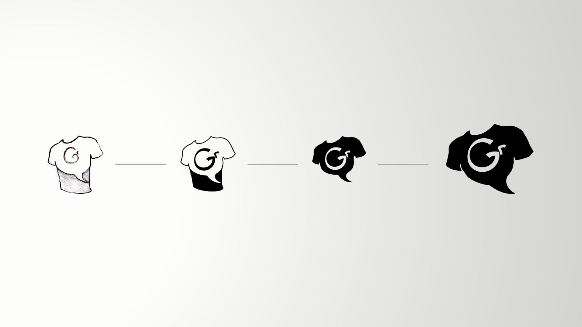
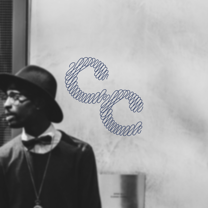
I zeroed in on what I felt was the best of the sketch explorations. The "Gr" monogram and the "Tee-Bubble" evolved iteratively from pencil sketches through digital refinement.
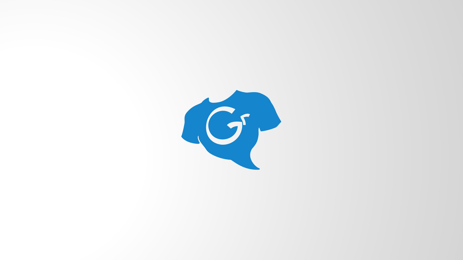
I love where I landed. Combining a hand-drawn shirt and speech bubble ("Tee-Bubble"), I had a memorable and versatile logo for Gabbyrags. The brandmark's angle and pitch are totally intended to give it that heroic poise. I mean, think about it, who is the extroverted life of the party if not the hero saving others from the dreads of another boring social gathering?
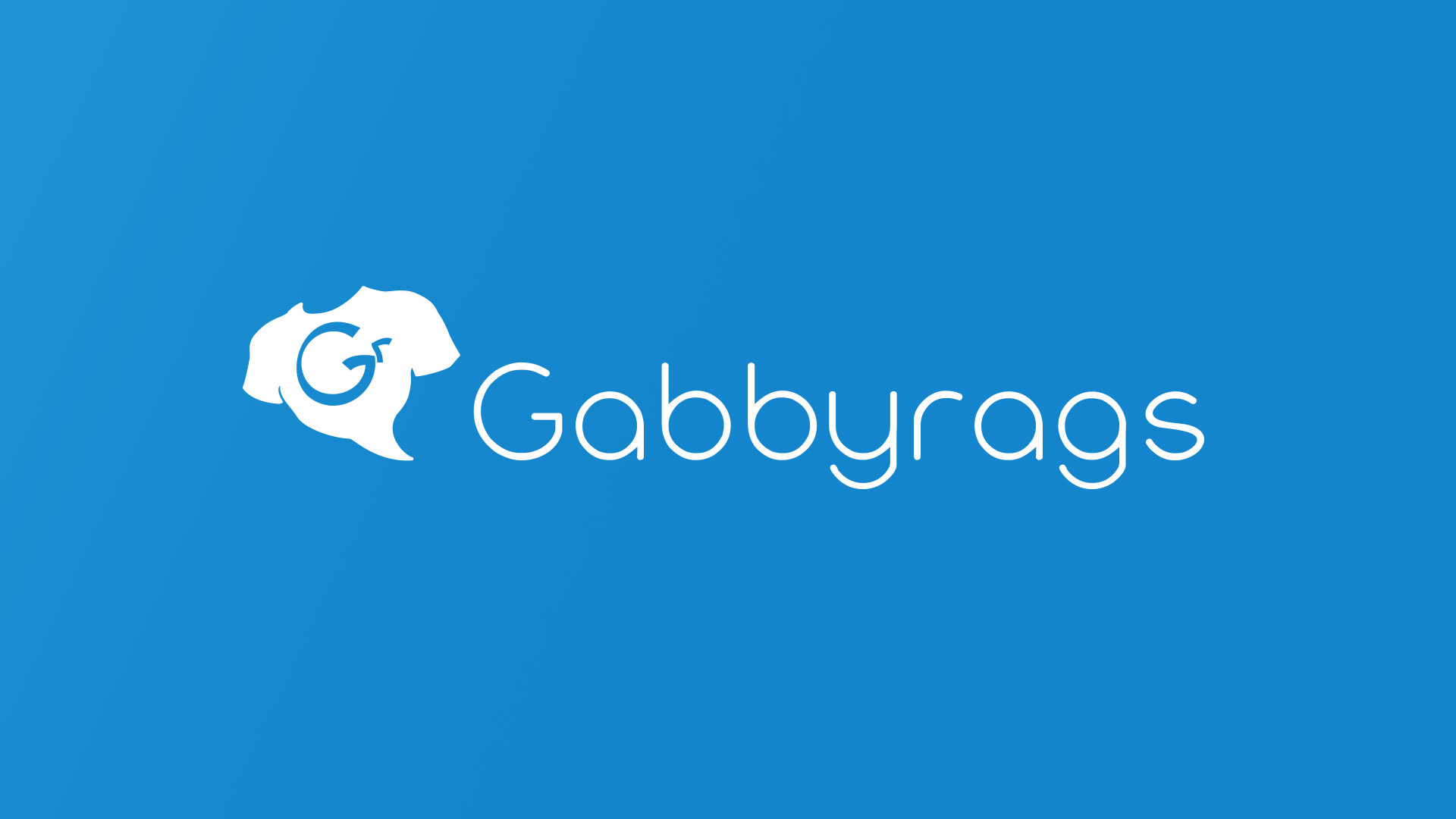
The typeface of the Gabbyrags wordmark had to be chummy. Something you felt comfortable pulling up a stool next to for a random chat. Unable to find the perfect blend of attributes, I developed my own using a simple circle and rounded ends as the basis for the type design.
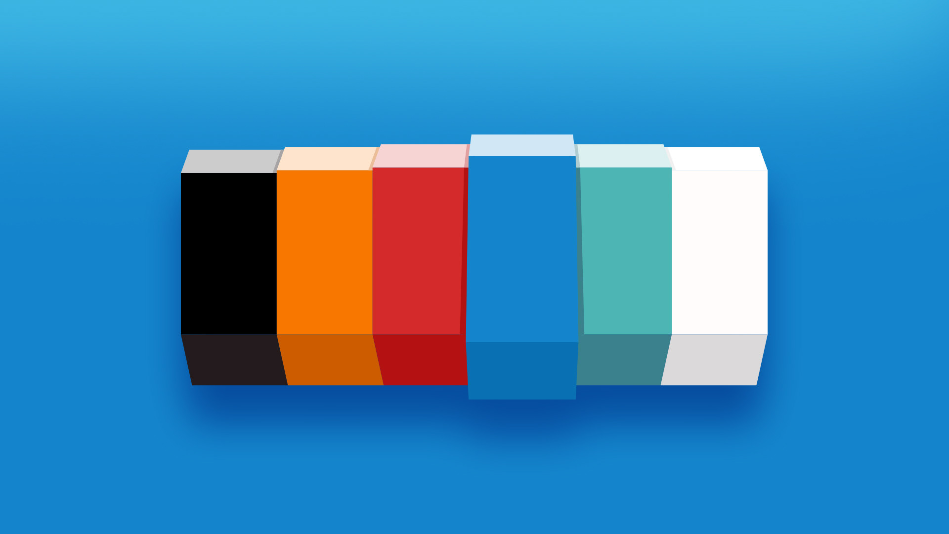
While blue is the center of the Gabbyrags superhero-inspired color palette, it made sense to me that the collection be varied. It is, after all, a brand that celebrates self expression.
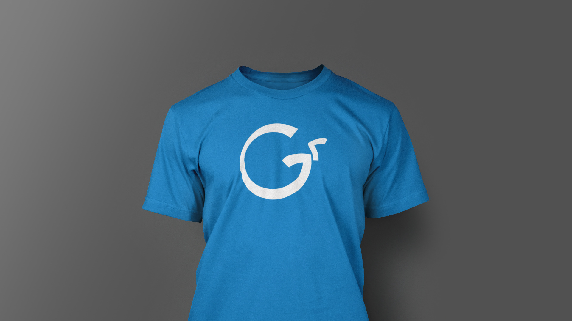
The thing I love most about this identity is its how modular it is. The mark can be striped down to its "Gr" monogram and still work well for the brand.