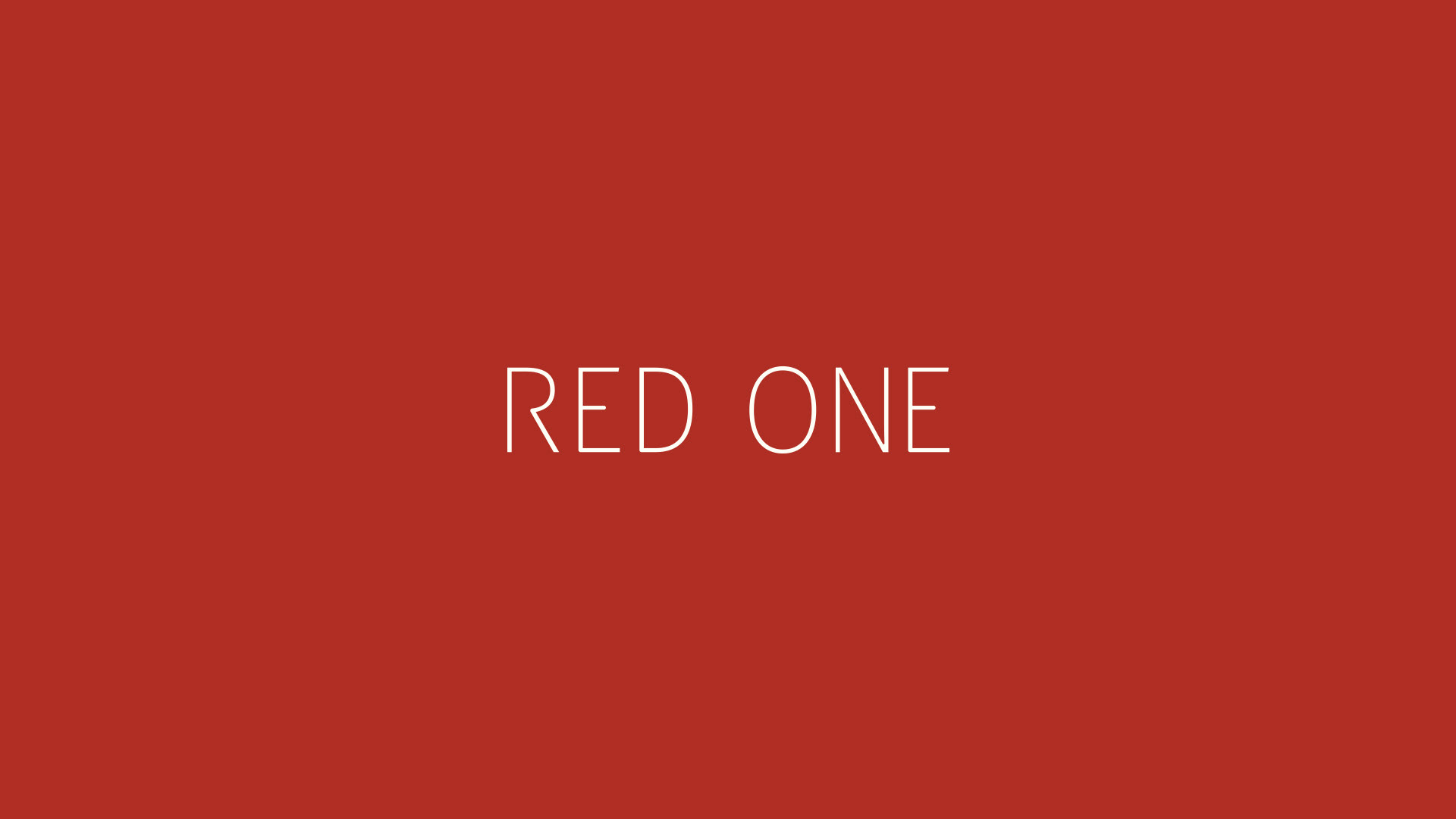
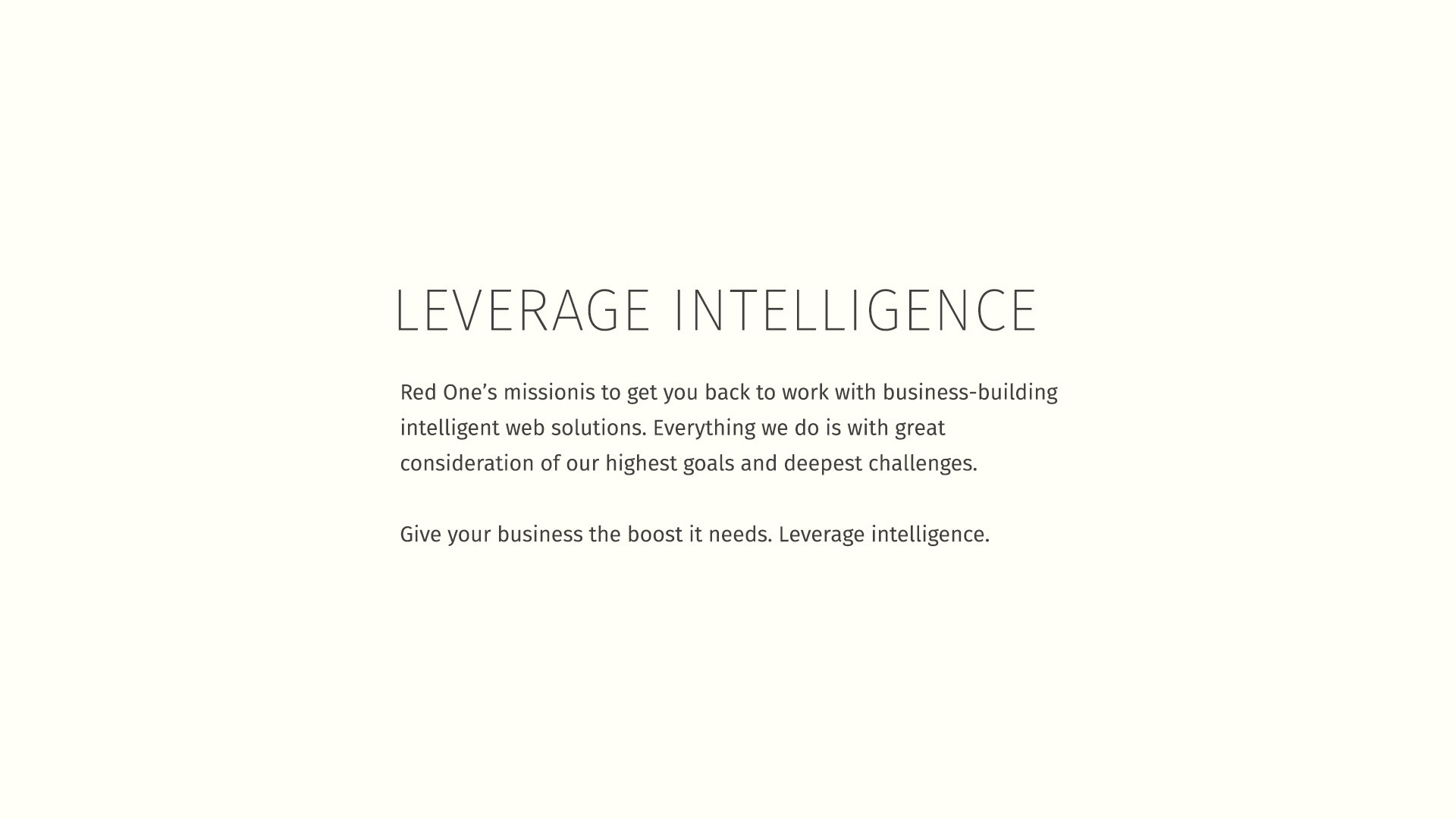
Red One is an Internet development and marketing consultancy in Atlanta, GA. The small team exists to create unique and intelligent online experiences in an increasingly competitive marketplace.
The Problem
Strong name. Weak identity. “Red One” is a brand name that demands a distinctive mark but hadn't one. The consultancy's brandmark was sufficient, but had no compelling visual story. It was also just a bit too complicated.
The Thinking
Make it simple. Like, really simple. Leverage the name. Capture a commanding distinction. The new mark had to be strong and versatile. It also had to have a bit of energy to it. Something that makes it feel simultaneously youthful and sophisticated.

Old logo on the left, new identity on the right. My work began with identifying redeemable attributes of the current logo. A simple typeface, generous space between letters and a tiny, red "1" gave inspiration to the redesign.

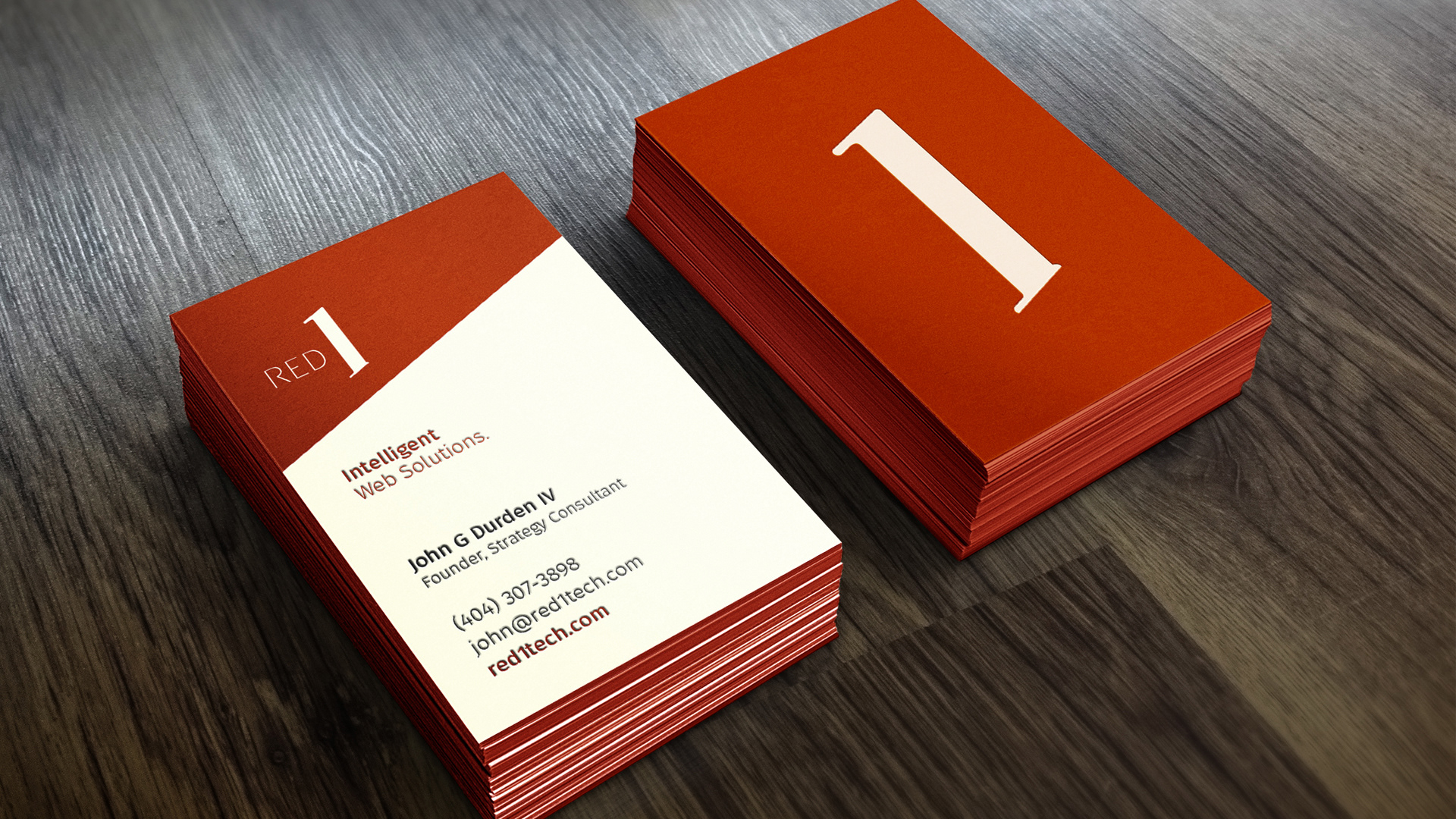
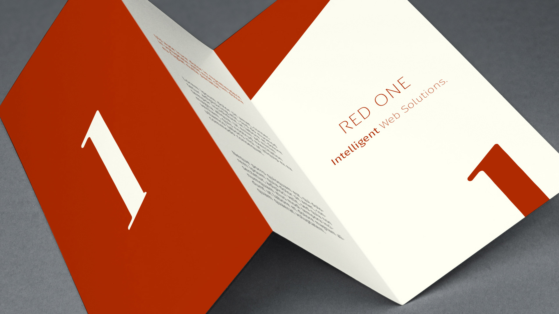
Explorations and experiments brought me to this; the distinctive numeral "1" I knew Red One needed to own. Digitally hand drawn and based on no typeface. This is the mark that, all by itself, can speak the name that commands respect and inspires trust: "Red One."
The full wordmark is a secondary style for the identity. It’s appropriate to employ when the "1" symbol is used separately but in close proximity. This secondary style help add flexibility to the brand identity system.
To complement the narrow and tall numeral "1" I chose Fira Sans 2, UltraLight and Book, for the brand's typography. Available for web and print from Adobe Typekit, this versatile font had the style and structure the Red One identity needed.
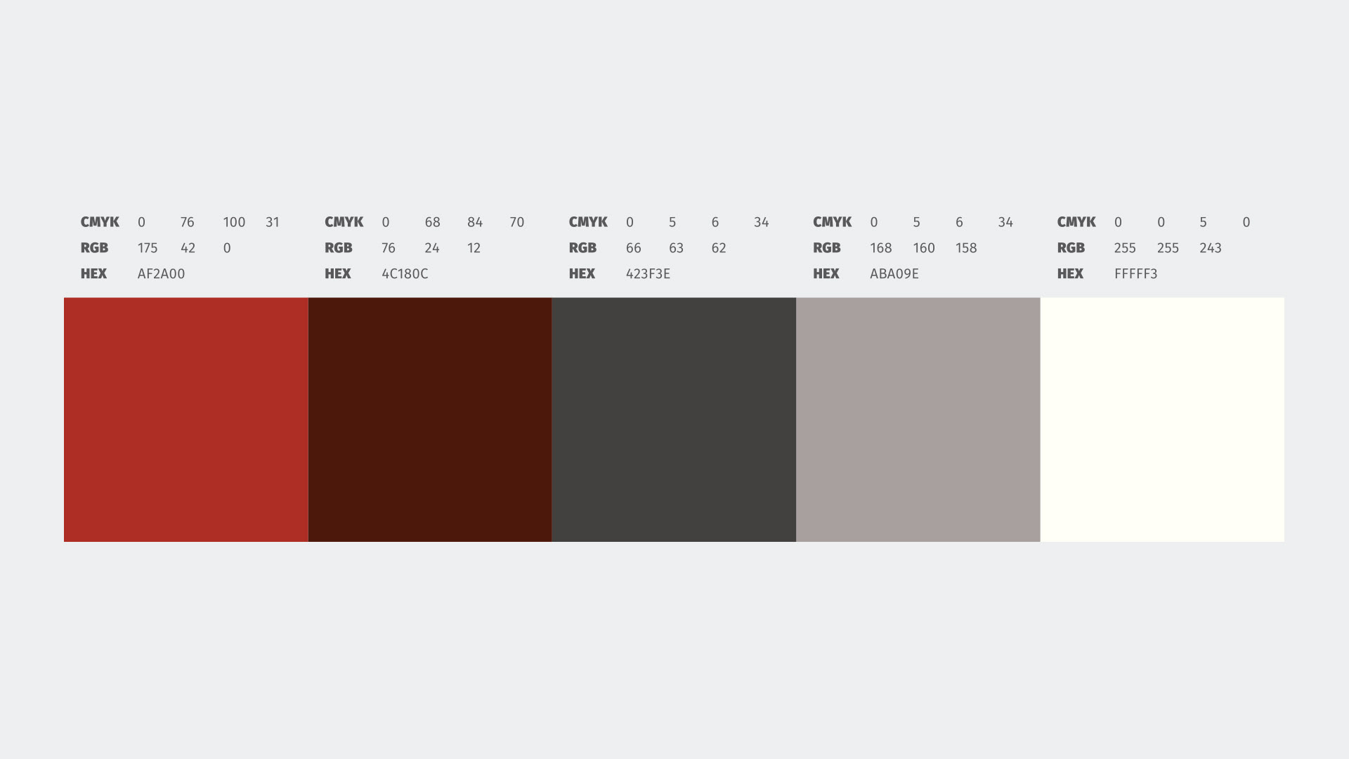
The core color palette for the identity system. Its members allow for fiery, energetic expression against neutral hues.
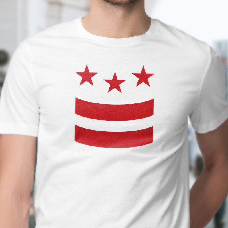
The applications
It helps to see how a brand's identity might look when in use. Here are a few items to show the application of the symbol, wordmark, type and color.